Smart Thermopot — designing a mobile app for a connected home appliance
Overview
A smart home startup came to us at the ideation stage with a clear vision: build affordable, stylish appliances for young families — think IKEA, but for connected home devices. They needed to show investors not just an idea, but a real product experience: who it's for, how it works, and what it looks like.
Our team of four designers was brought in to take that vision from zero to a tangible concept. I led the UX research and UI design work, mapping out the user landscape, defining the core experience, and designing the app screens that would become the face of the pitch.
Project Goals
Research & User Insight
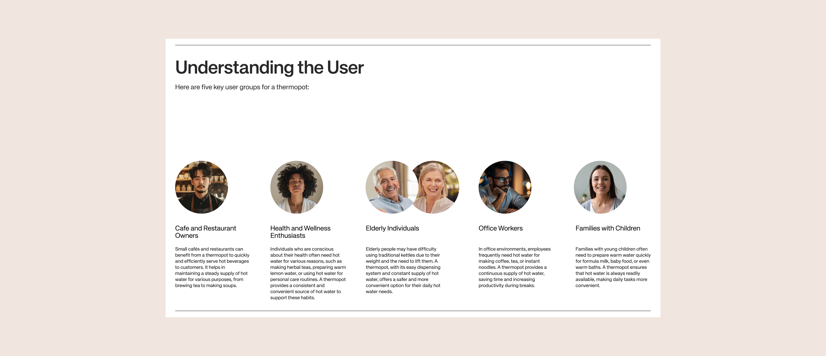
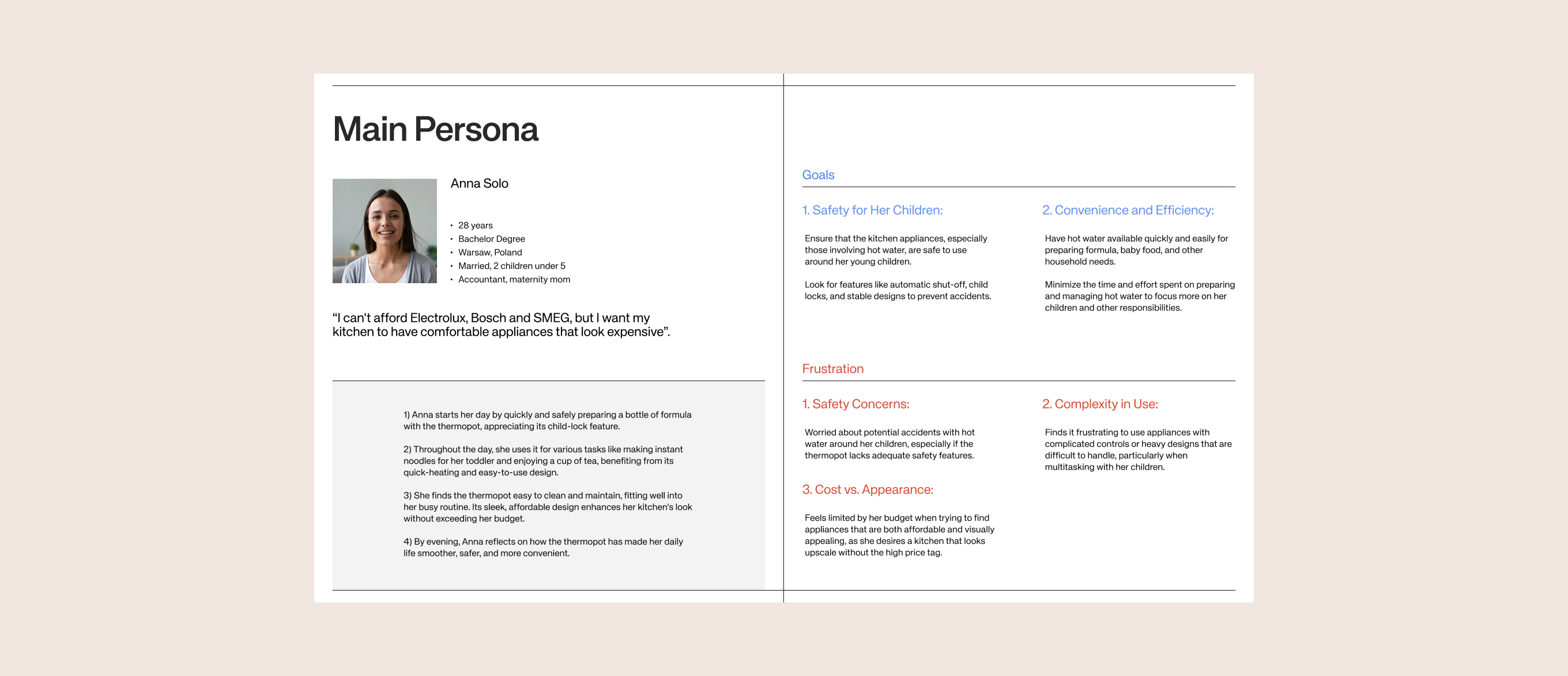
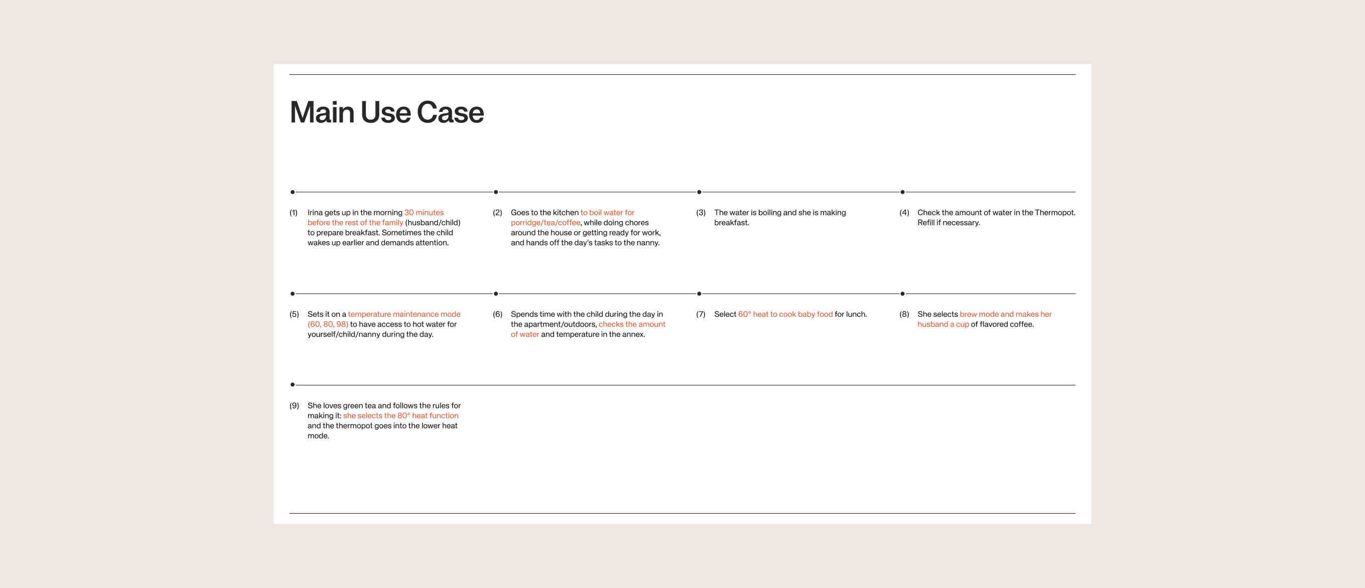
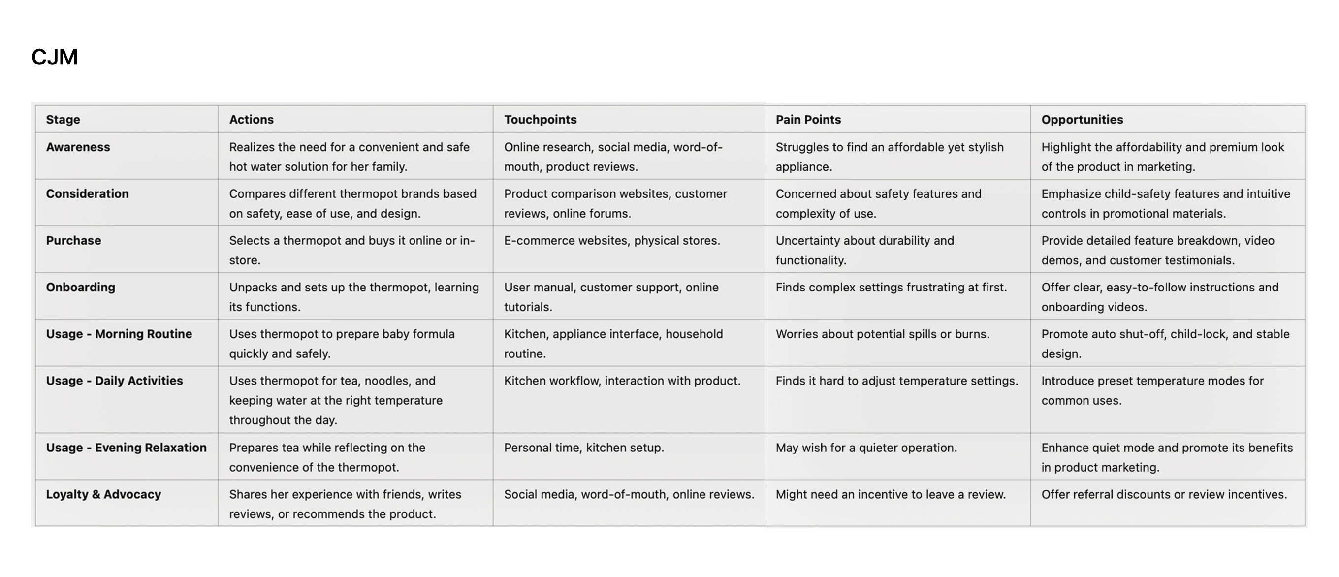
I identified five user groups — families with children, elderly users, office workers, café owners, and health enthusiasts — and developed a primary persona: a busy mom who needs hot water ready throughout the day, quickly and safely.
The key insight from research was that existing apps in this category were either overloaded with settings nobody used, or so stripped-down they offered no real control. The opportunity was in the middle: clear, fast, and purposeful.
Design Decisions
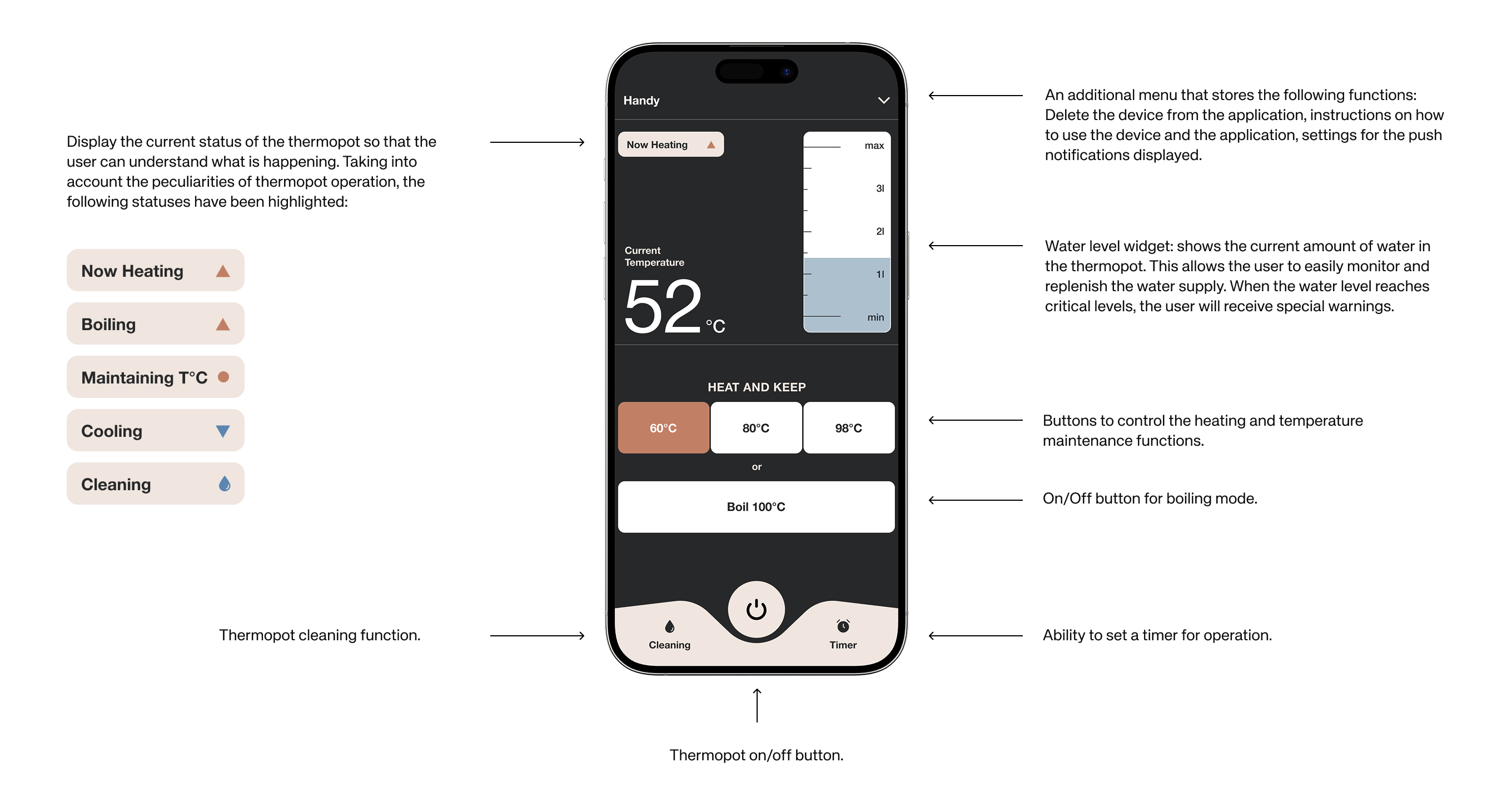
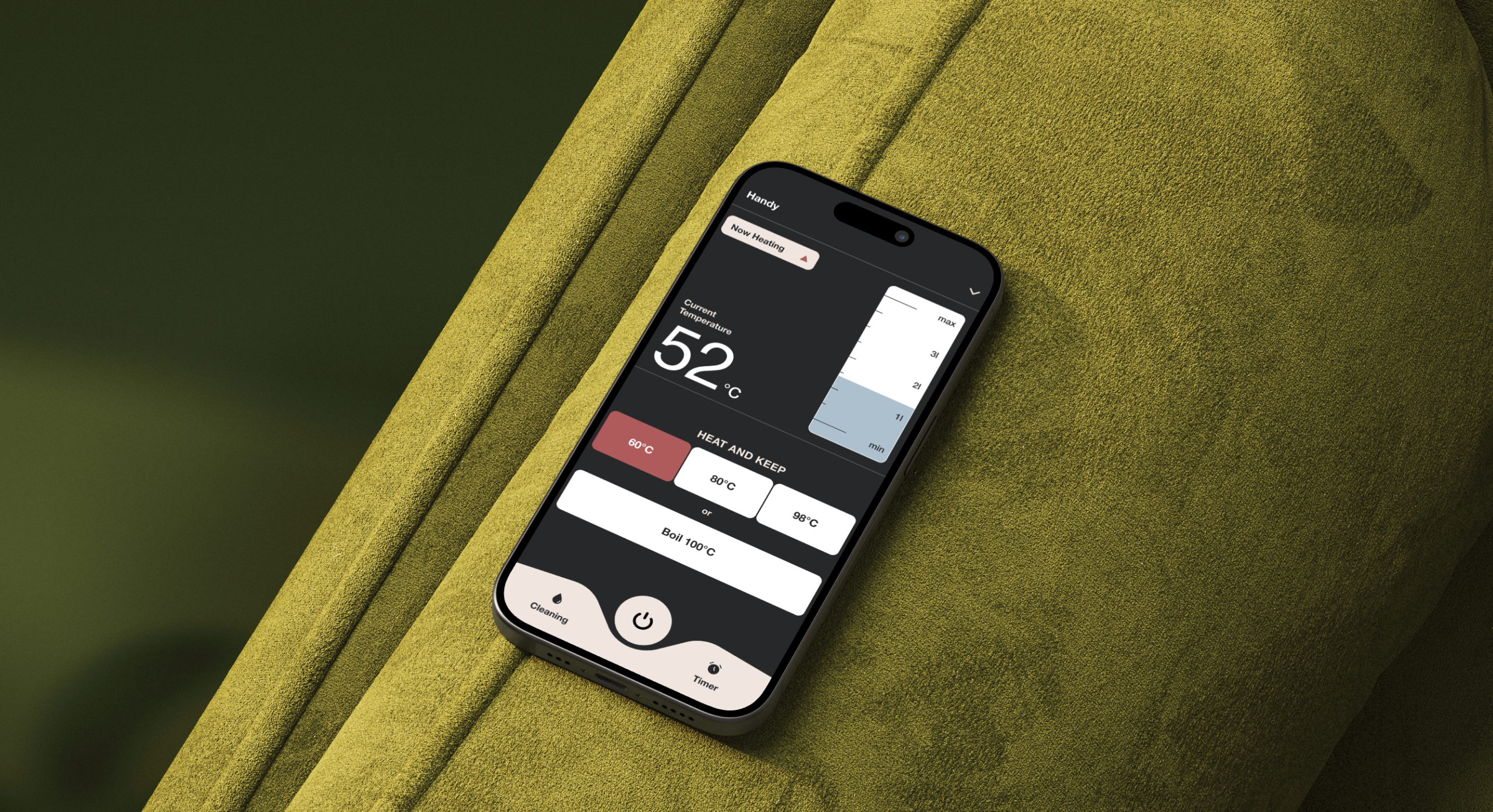
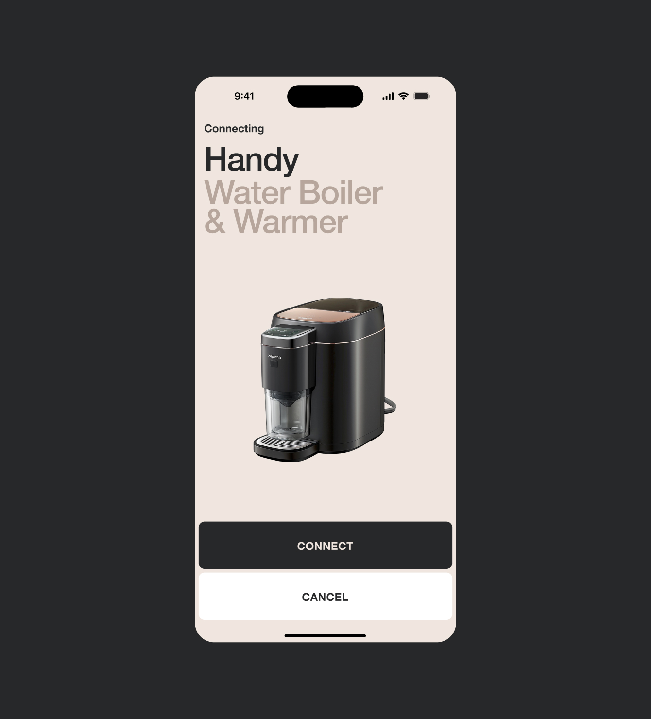
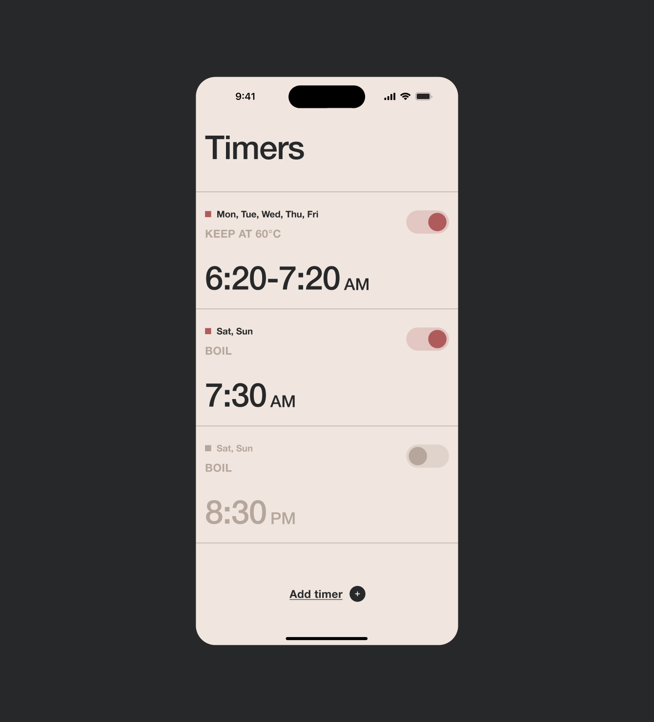
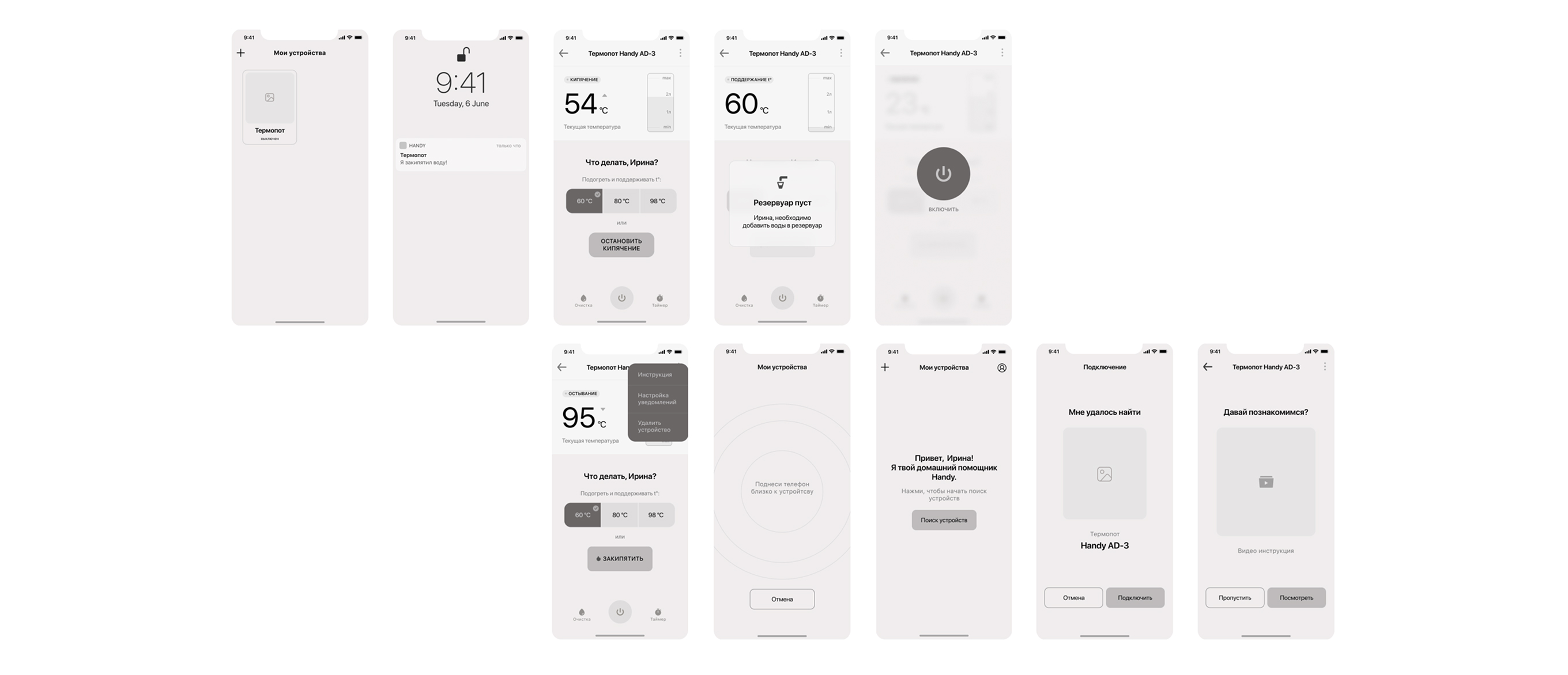
Based on the CJM and competitor gaps, I made three core decisions: reduce temperature options to three presets (60°C, 80°C, 98°C) that map directly to real use cases; surface water level and device status on the main screen so users never have to dig for it; and add a safety lock feature as a first-class UI element, not a buried setting.
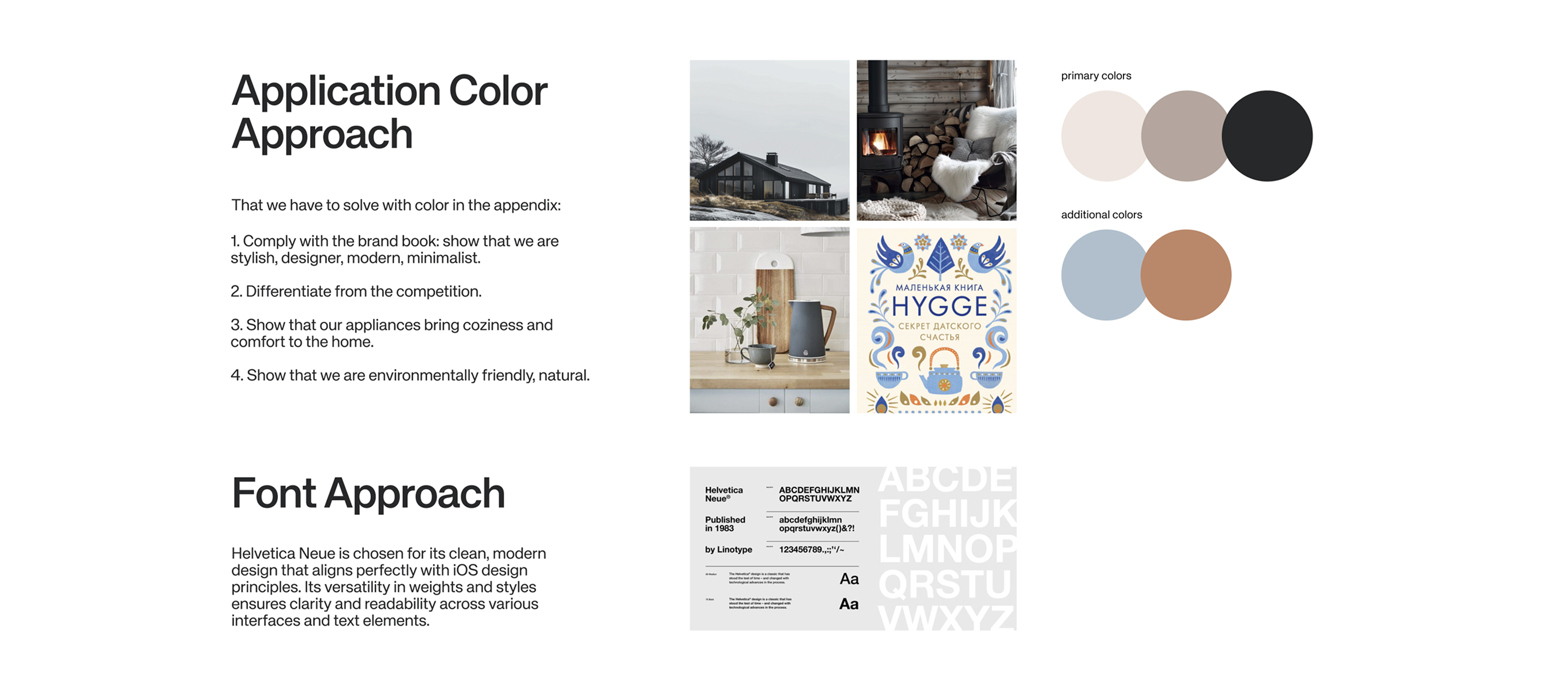
The visual direction followed the brand's four principles — Stylish, Available, Minimalist, Comfortable — using a soft neutral palette, rounded shapes, and typography that feels calm rather than technical.
Key Takeaway
IoT design taught me that the physical and digital experience are inseparable. When someone interacts with a real object — hot water, a child nearby, a morning routine — every moment of confusion in the app has real consequences.
The discipline of cutting features rather than adding them was the hardest and most valuable part of this project.