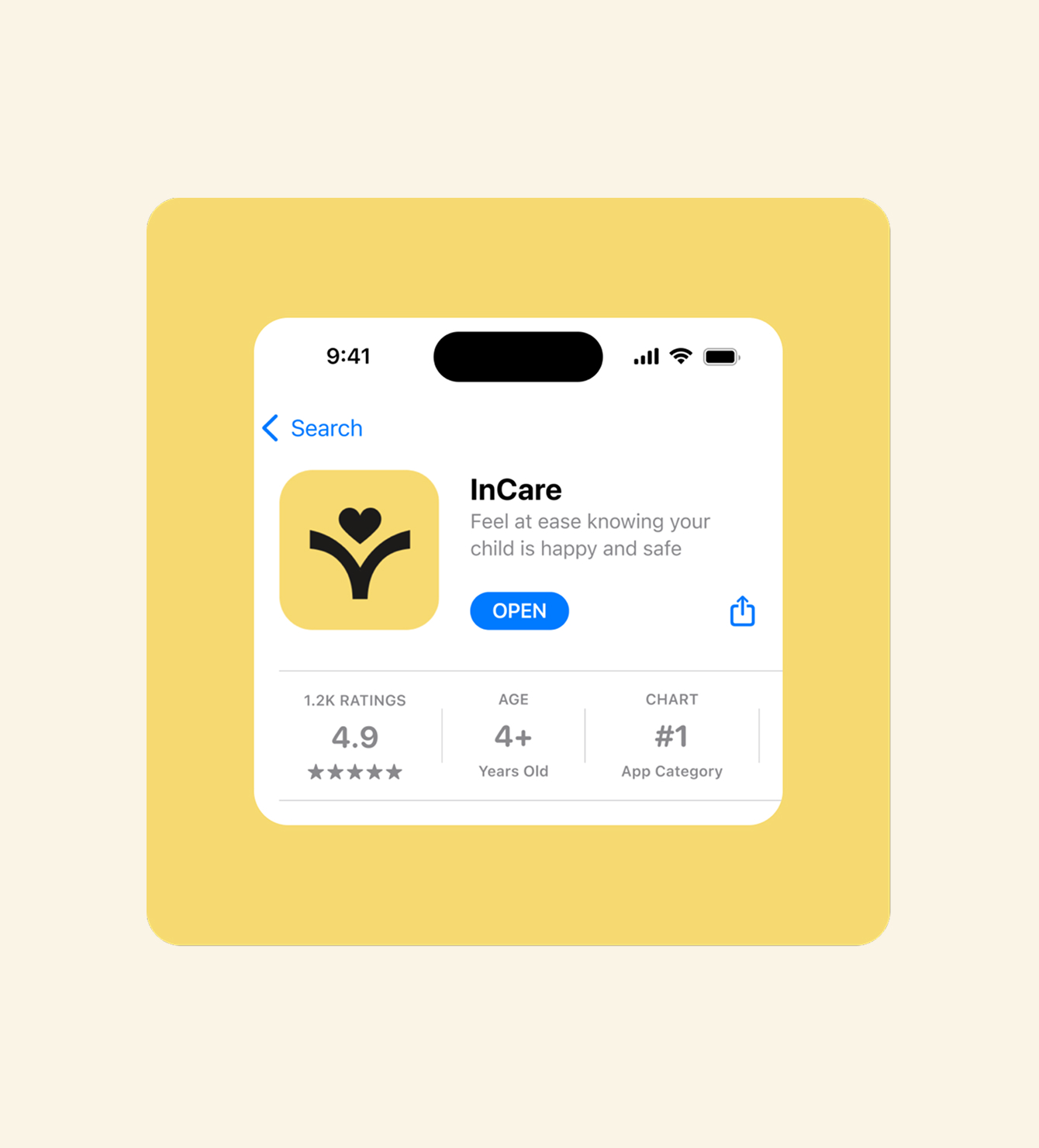
InCare — designing a daycare monitoring app for connected, informed parents
Visit website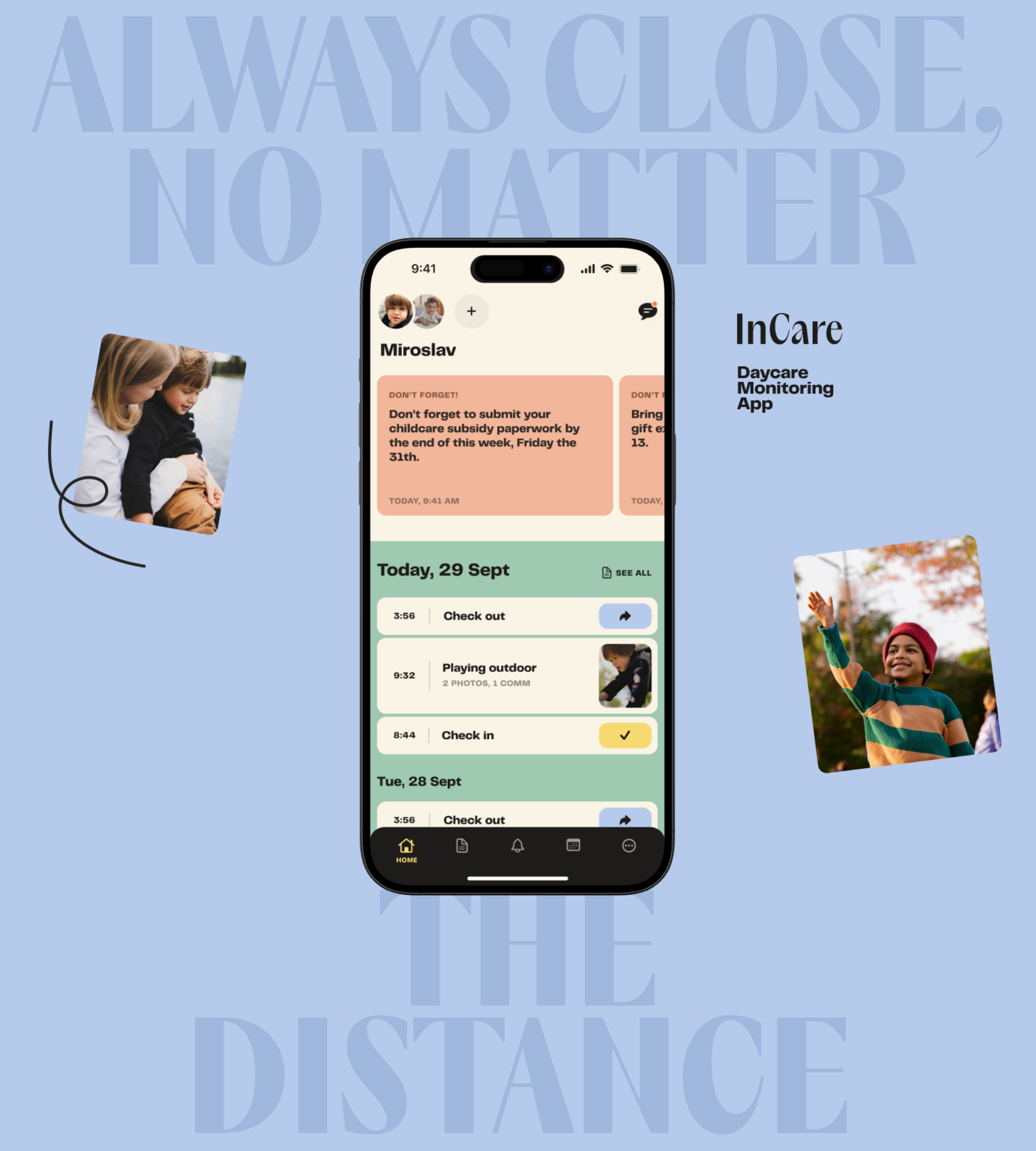
Overview
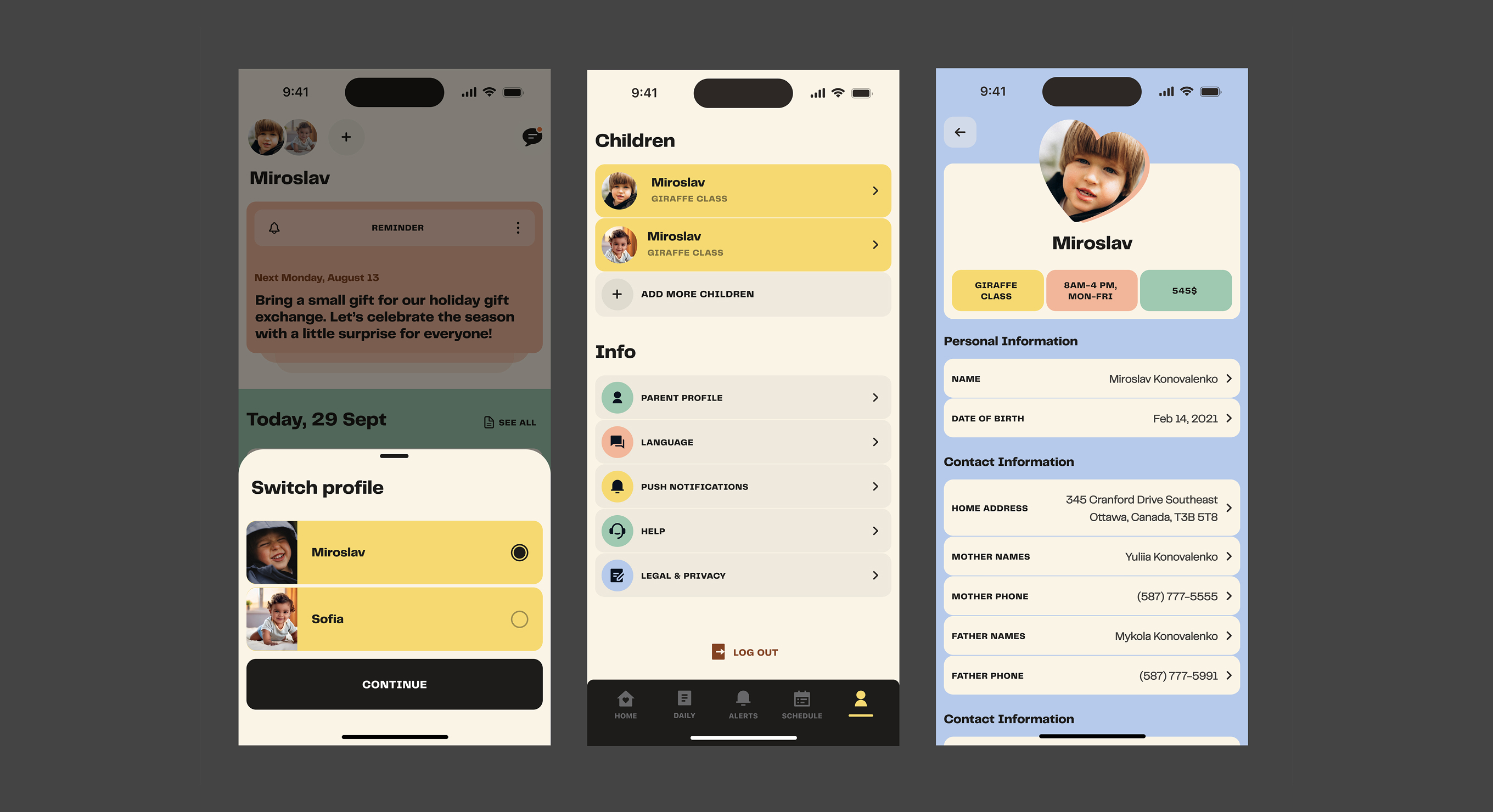
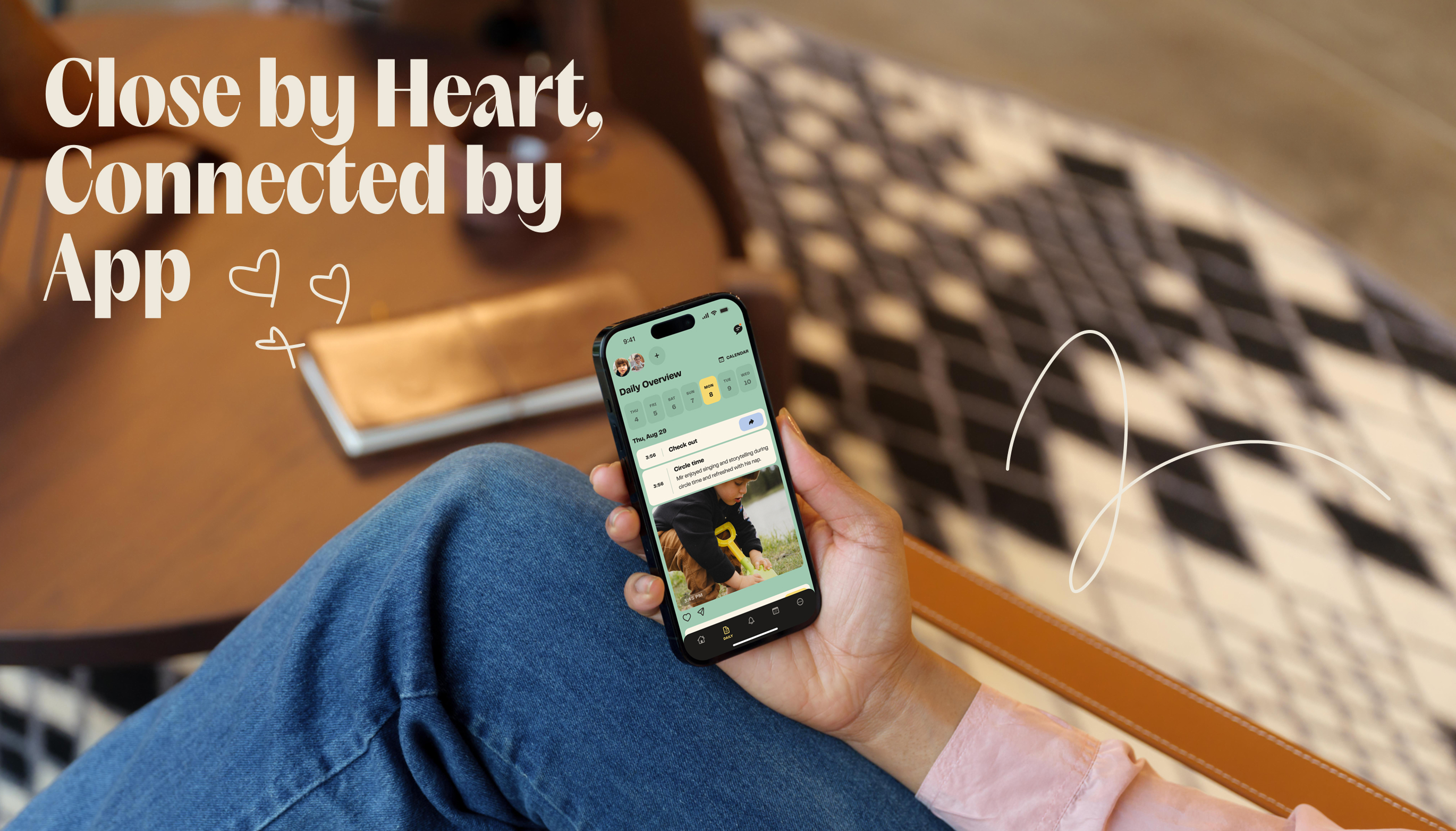
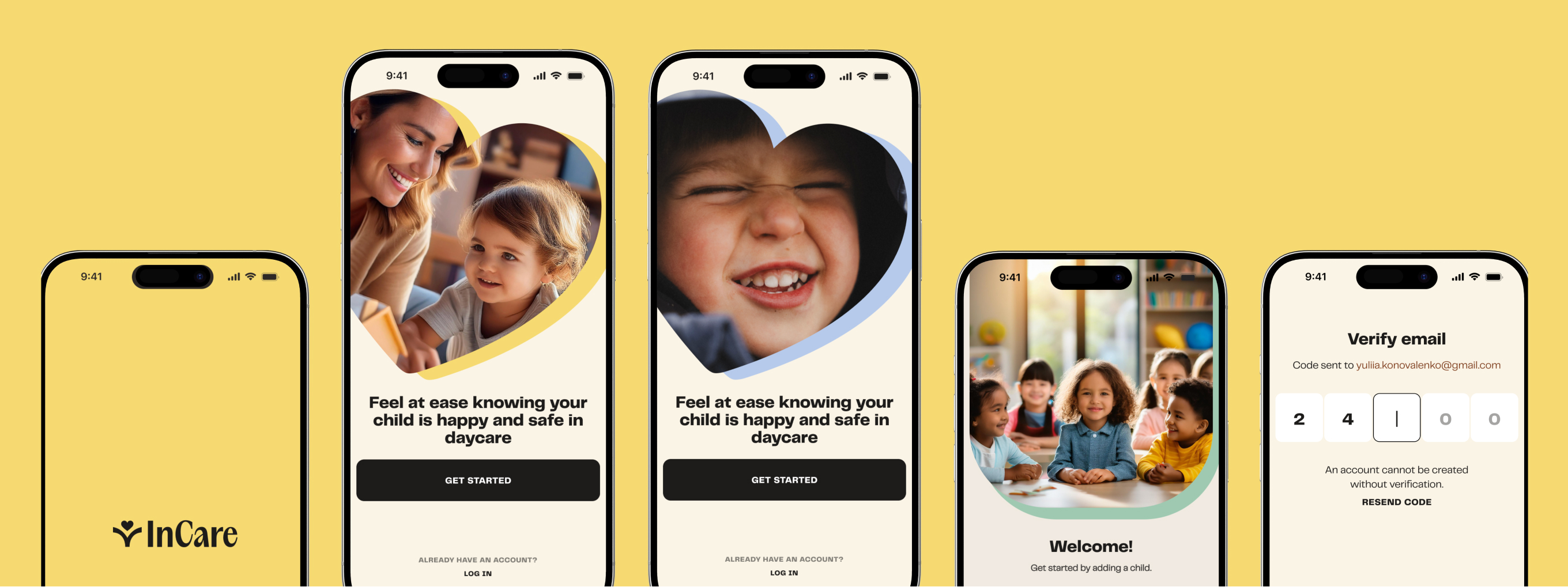
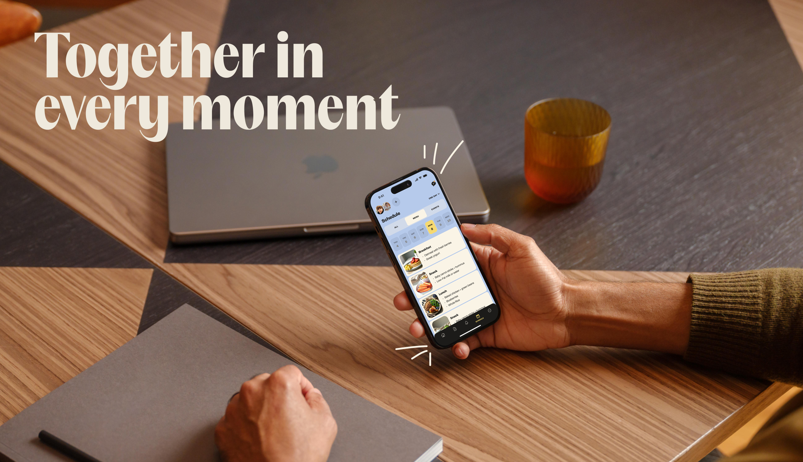
A self-initiated project to deepen my mobile product design skills — a daycare monitoring app that helps parents stay informed, receive real-time updates, and communicate seamlessly with daycare staff.
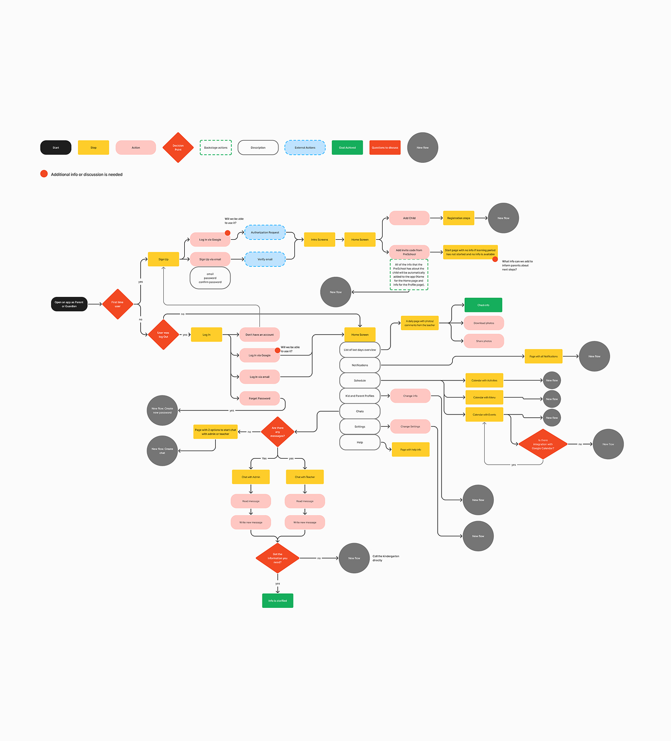
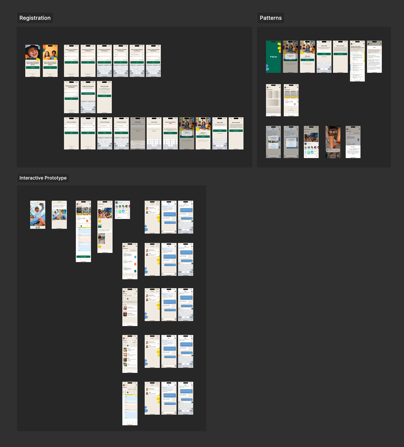
I designed the complete product over 120+ hours, going through competitive research, three iterations of user flows, and two rounds of UI design — from Apple native components to a fully custom design system.
Research
The market is dominated by Brightwheel and HiMama (Lillio), both with 4.9/5 App Store ratings. I analyzed customer reviews to uncover pain points, studied their UX patterns to understand what makes them work, and compared features to identify opportunities — particularly around notification balance and AI-driven personalization that neither had built well.
Project Goals
I started with Apple's Human Interface Guidelines to establish solid UX foundations — native iOS components, accessibility best practices, and seamless system integration. This gave the product a reliable base before any custom styling.
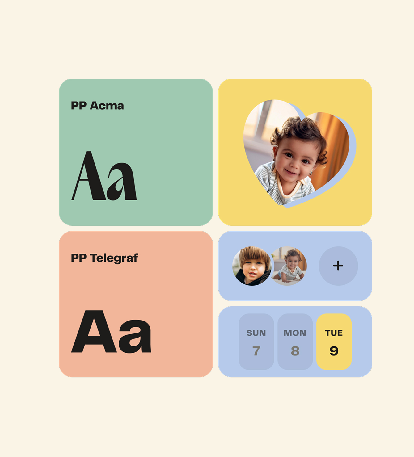
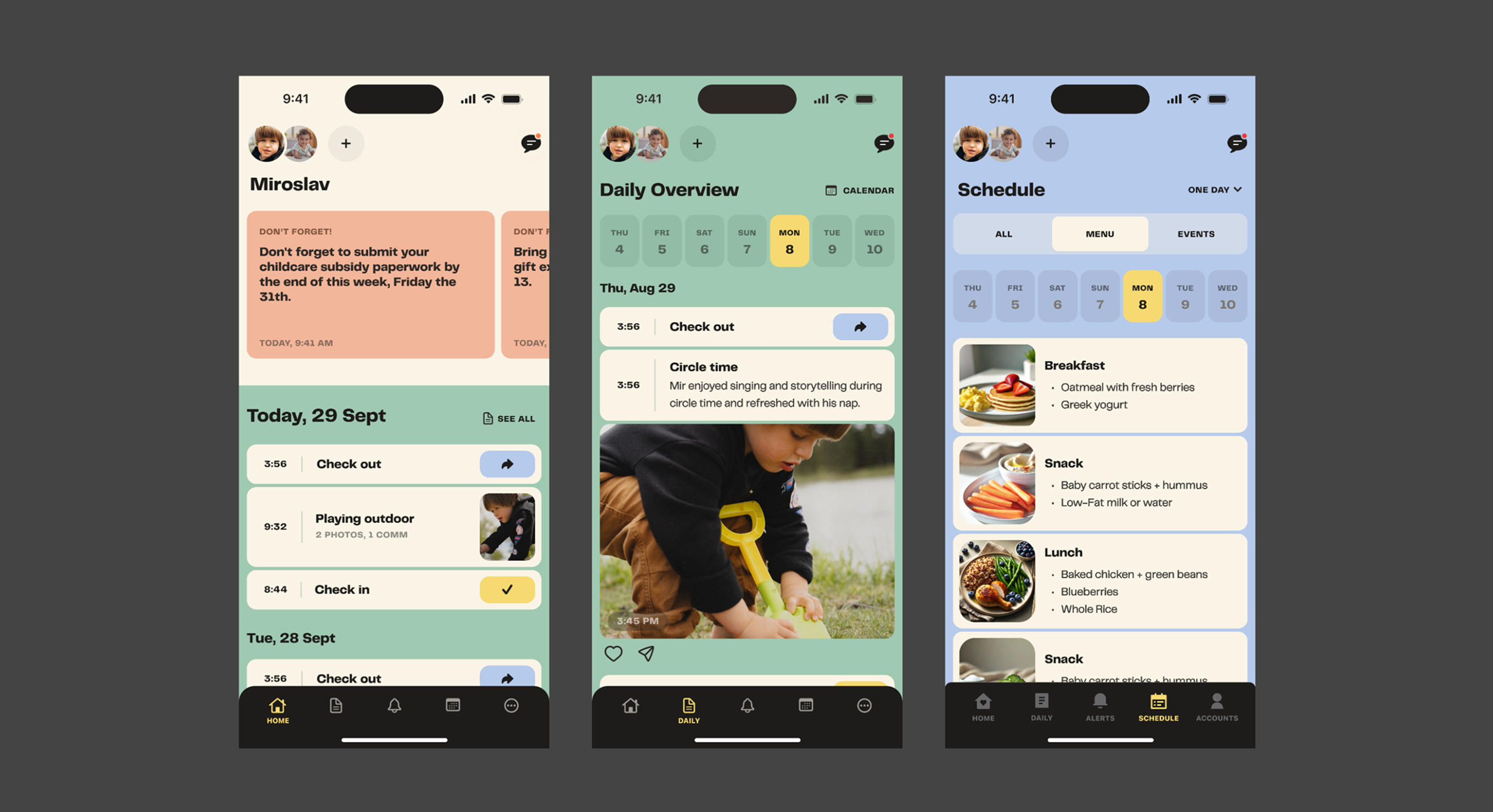
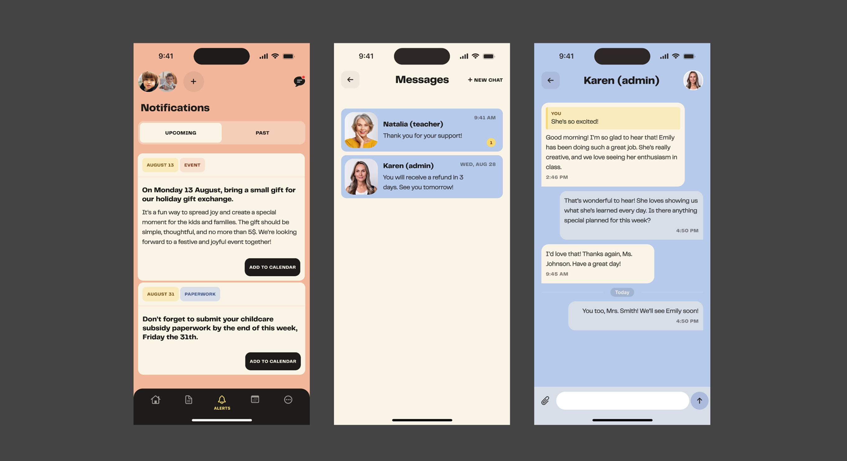
Once the structure was validated through three flow iterations, I moved to a custom design system — a pastel color palette for a warm, parent-friendly feel, custom typography and iconography, and a balance between playful and professional that builds trust without feeling like a toy.
Key Takeaway
Choosing a problem space I understood deeply — family routines, daily communication, trust between parents and caregivers — made for sharper design decisions and more meaningful research insights.
The project strengthened my mobile-specific UX thinking: how IA from web translates (and doesn't) to mobile, how notification design is its own discipline, and how Apple's guidelines are a starting point, not a ceiling.