SaaStorm — designing a website for a B2B SaaS organic growth agency
Overview
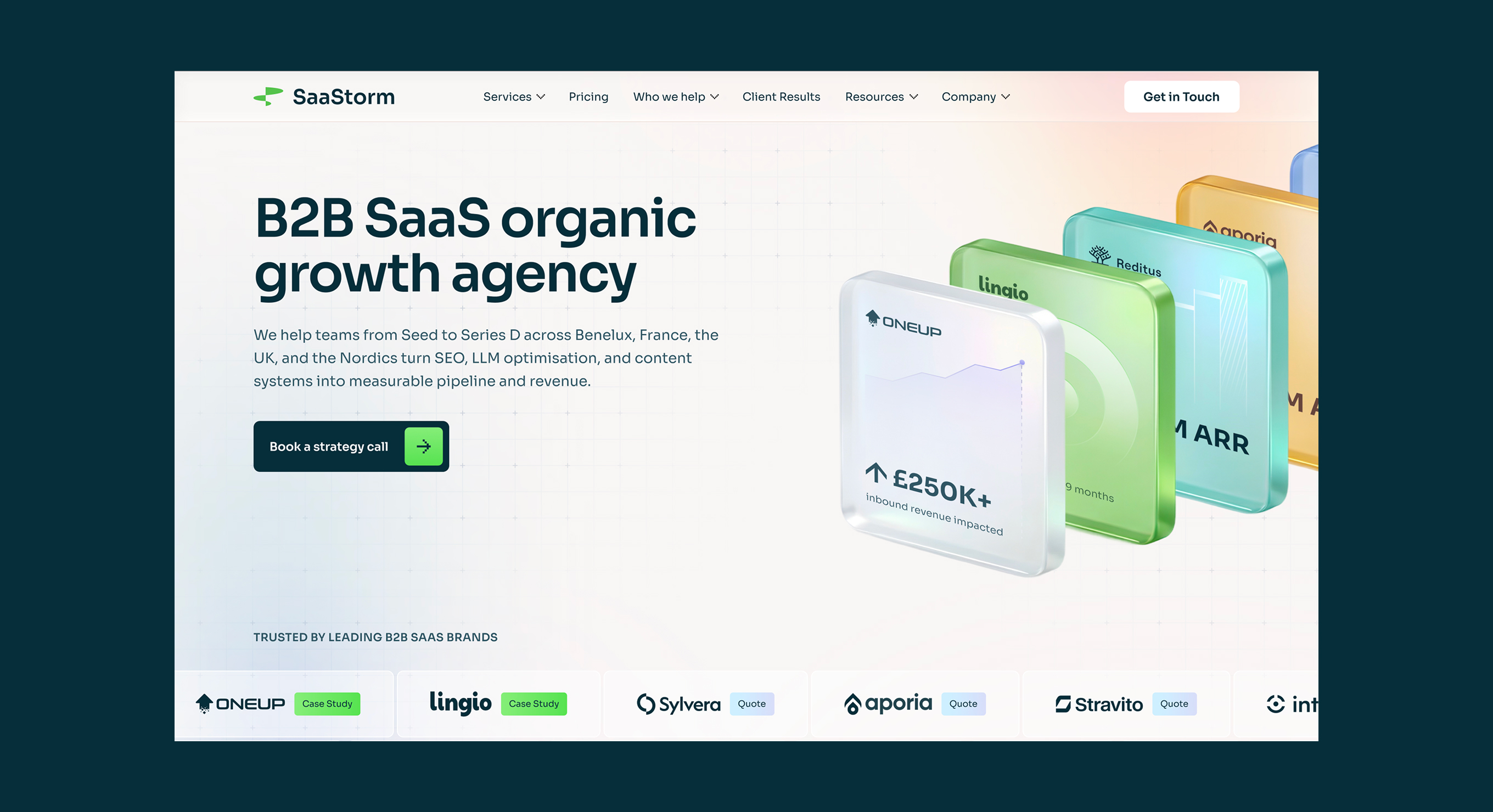
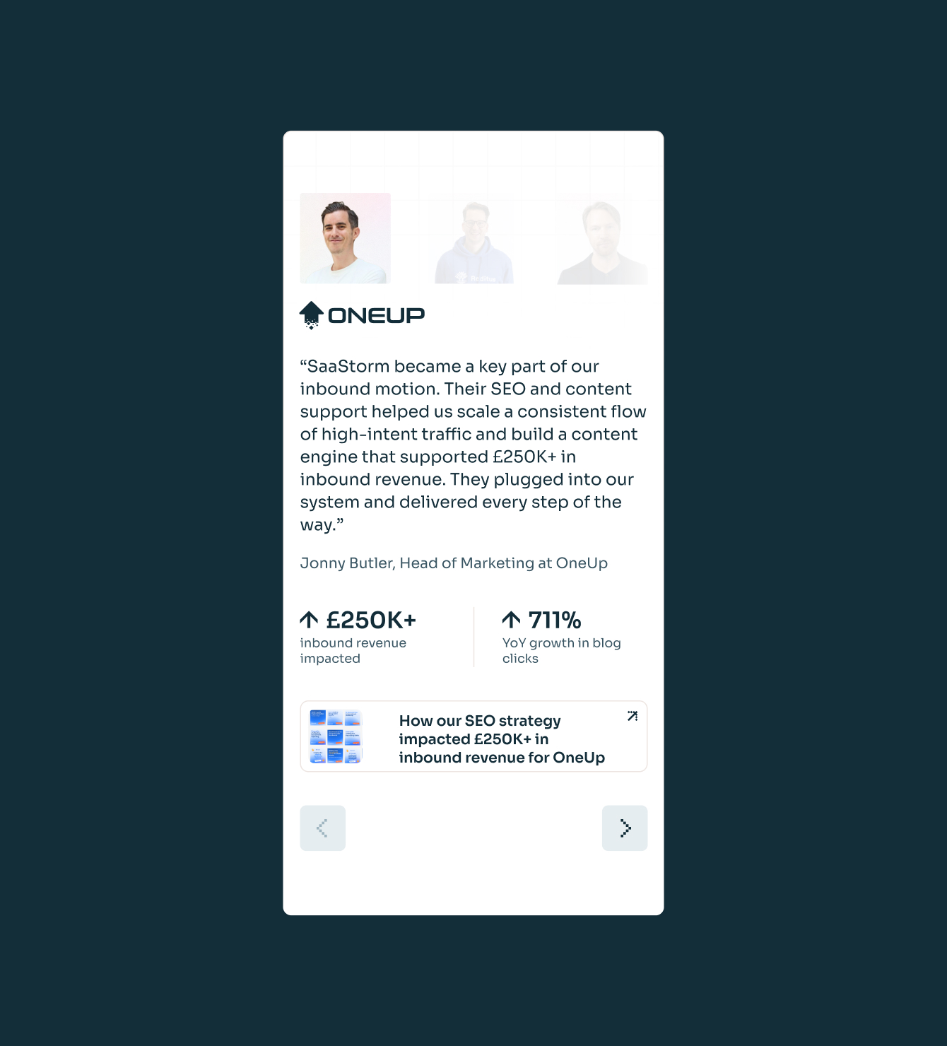
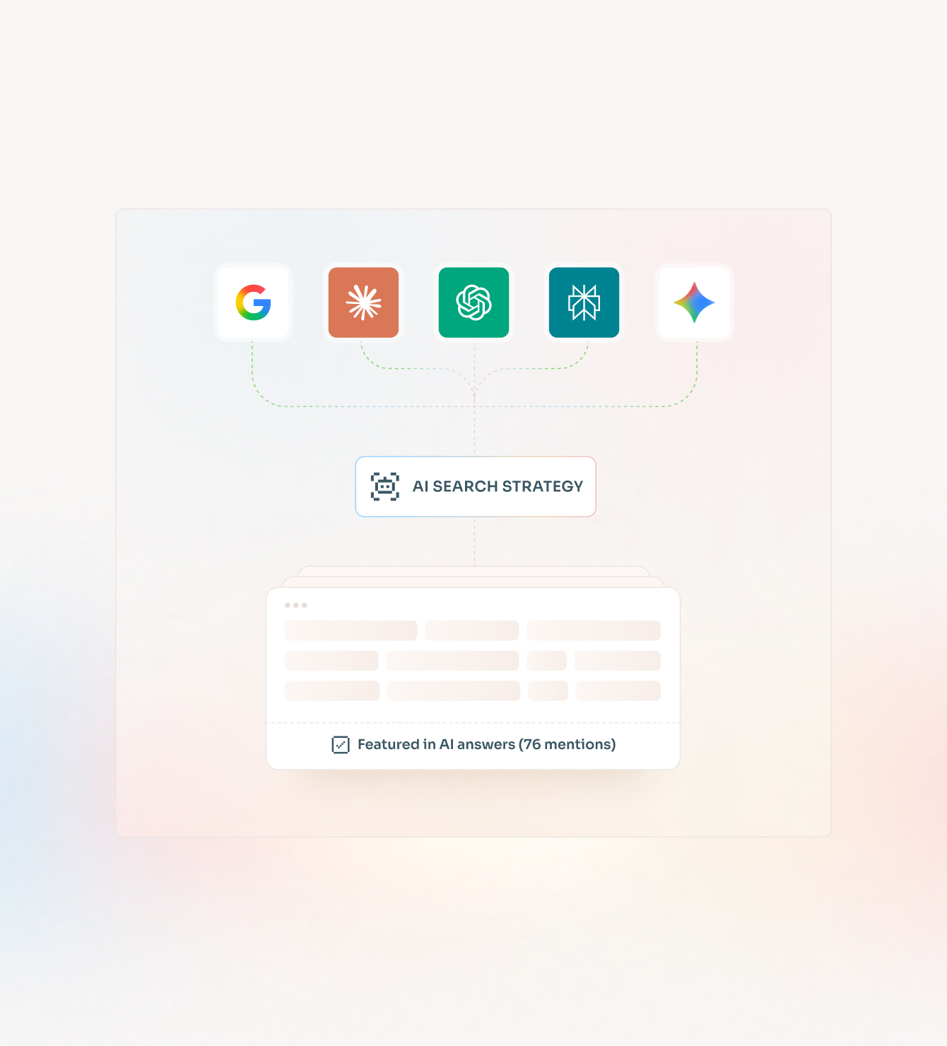
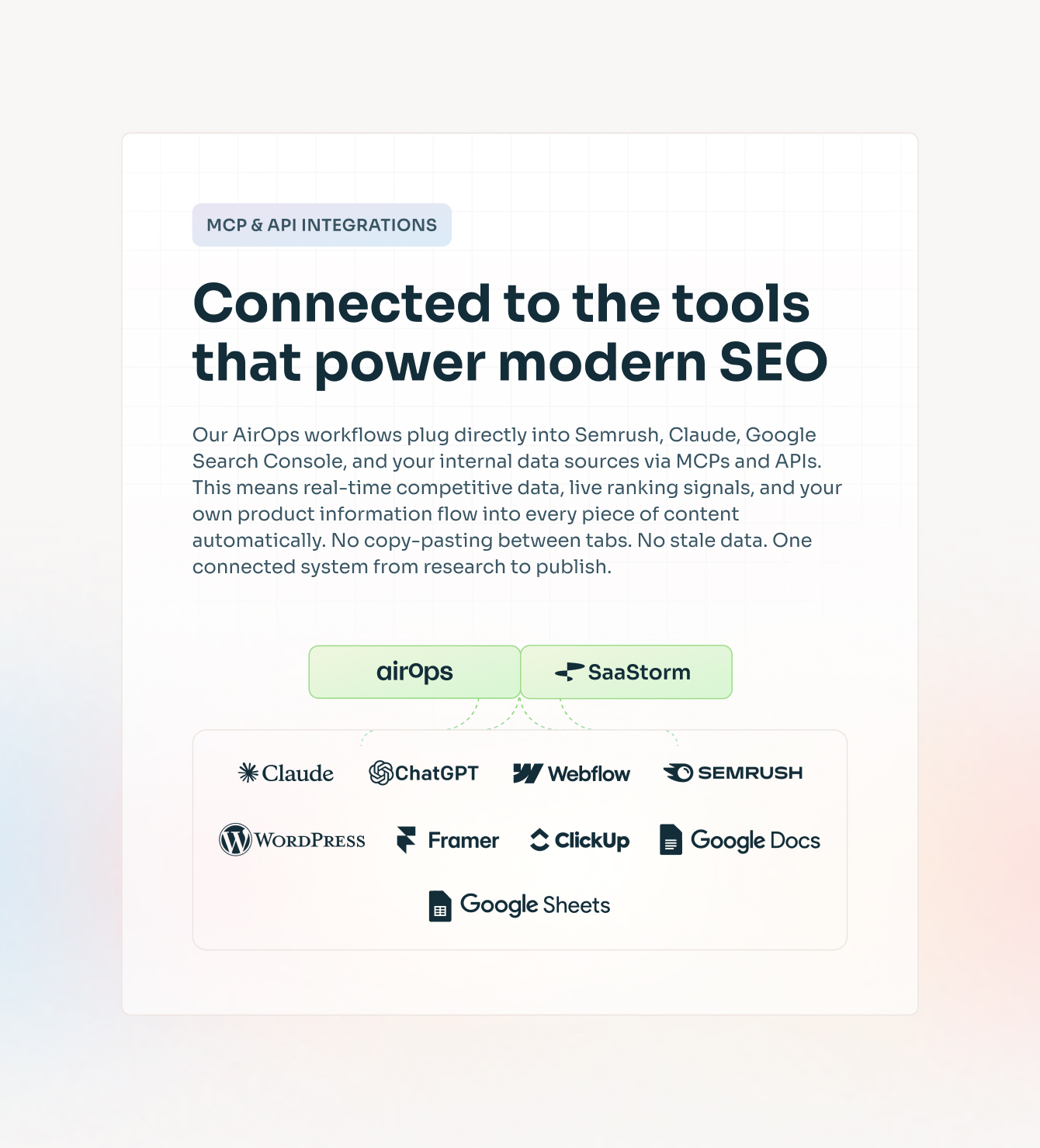
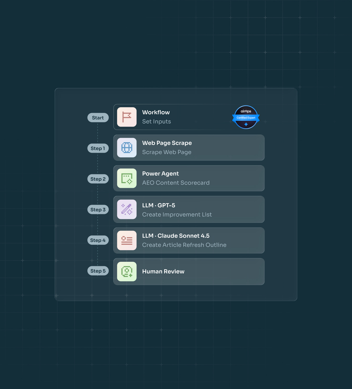
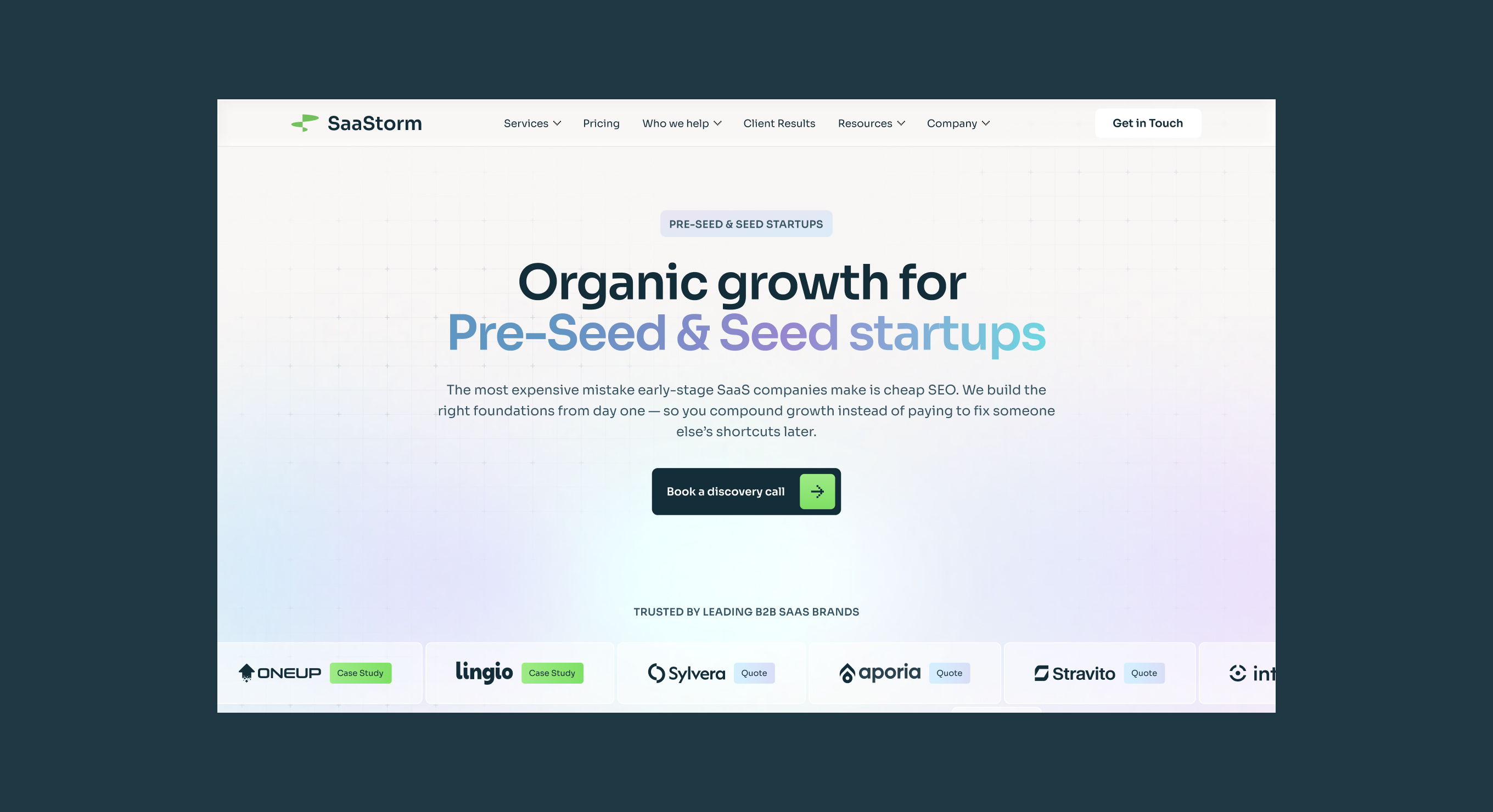
SaaStorm is a B2B SaaS agency focused on organic growth — SEO, AI search visibility, and content systems for teams from Seed to Series D. They came with an existing site and a clear goal: redesign it to better communicate their positioning and results to founders and CMOs.
The client provided all content upfront. There was no brand identity work — the challenge was to find a visual language that felt right for them quickly, and then build a complete, scalable site system around it.

Project Goals
Challenges
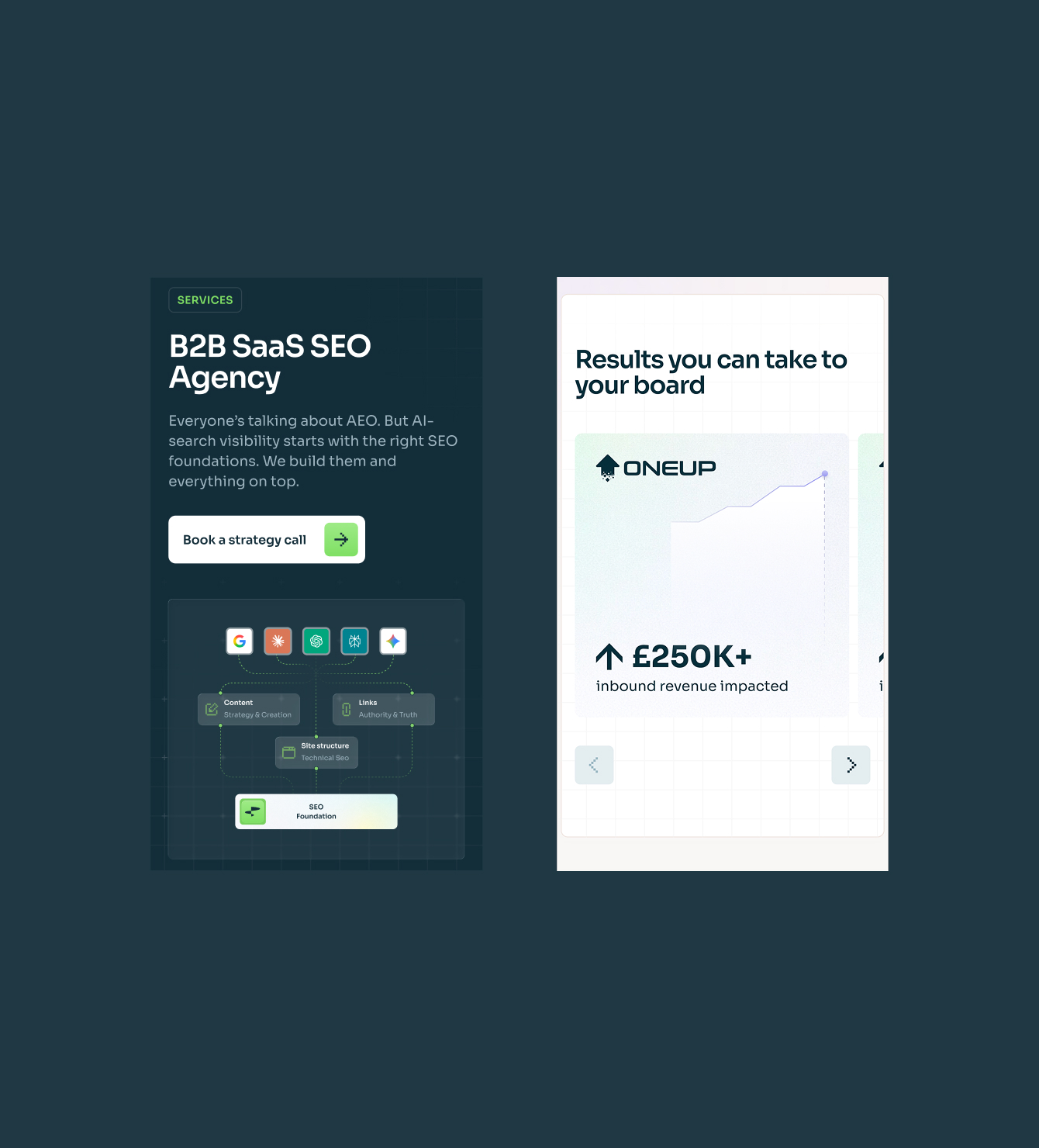
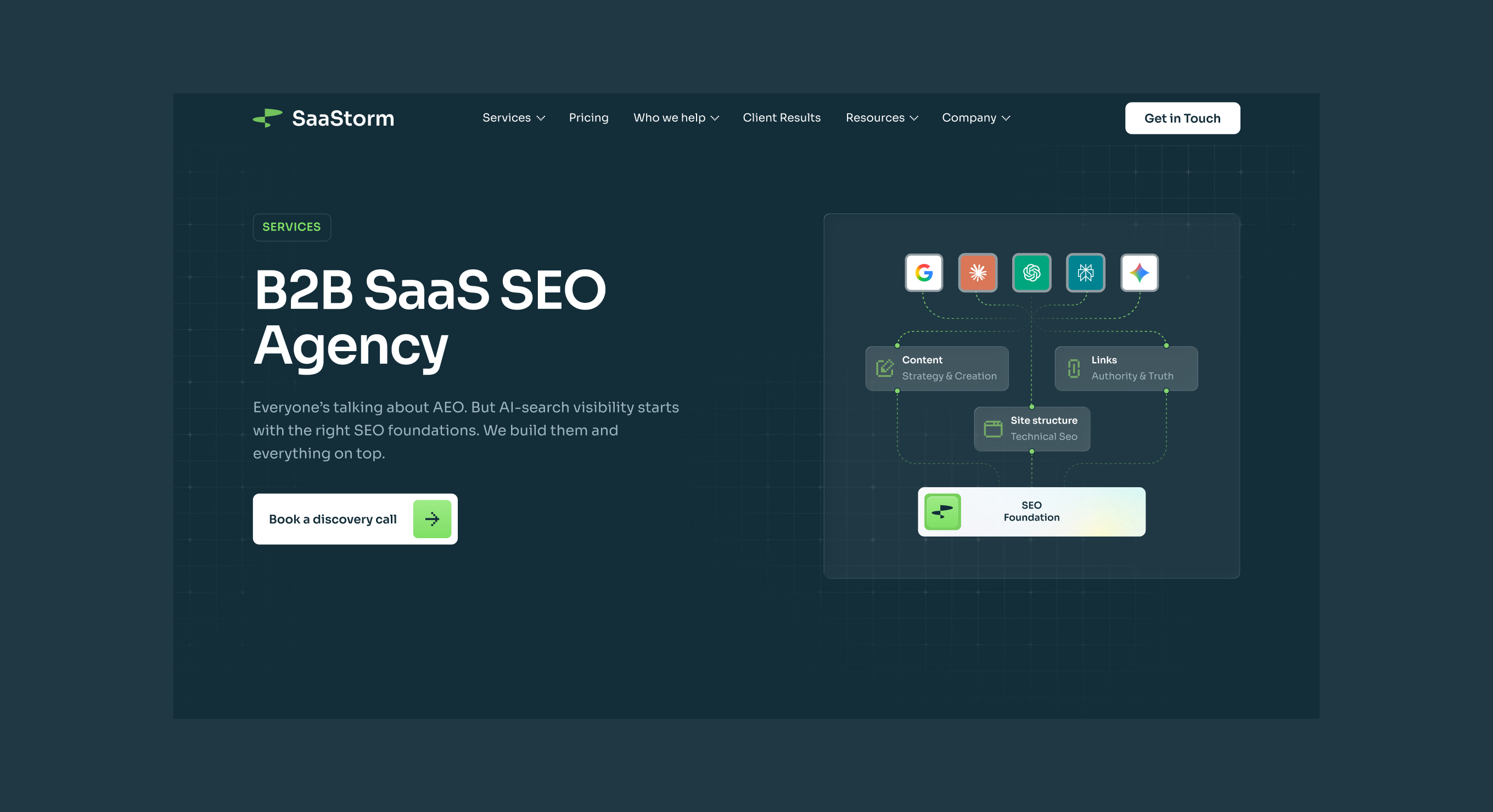
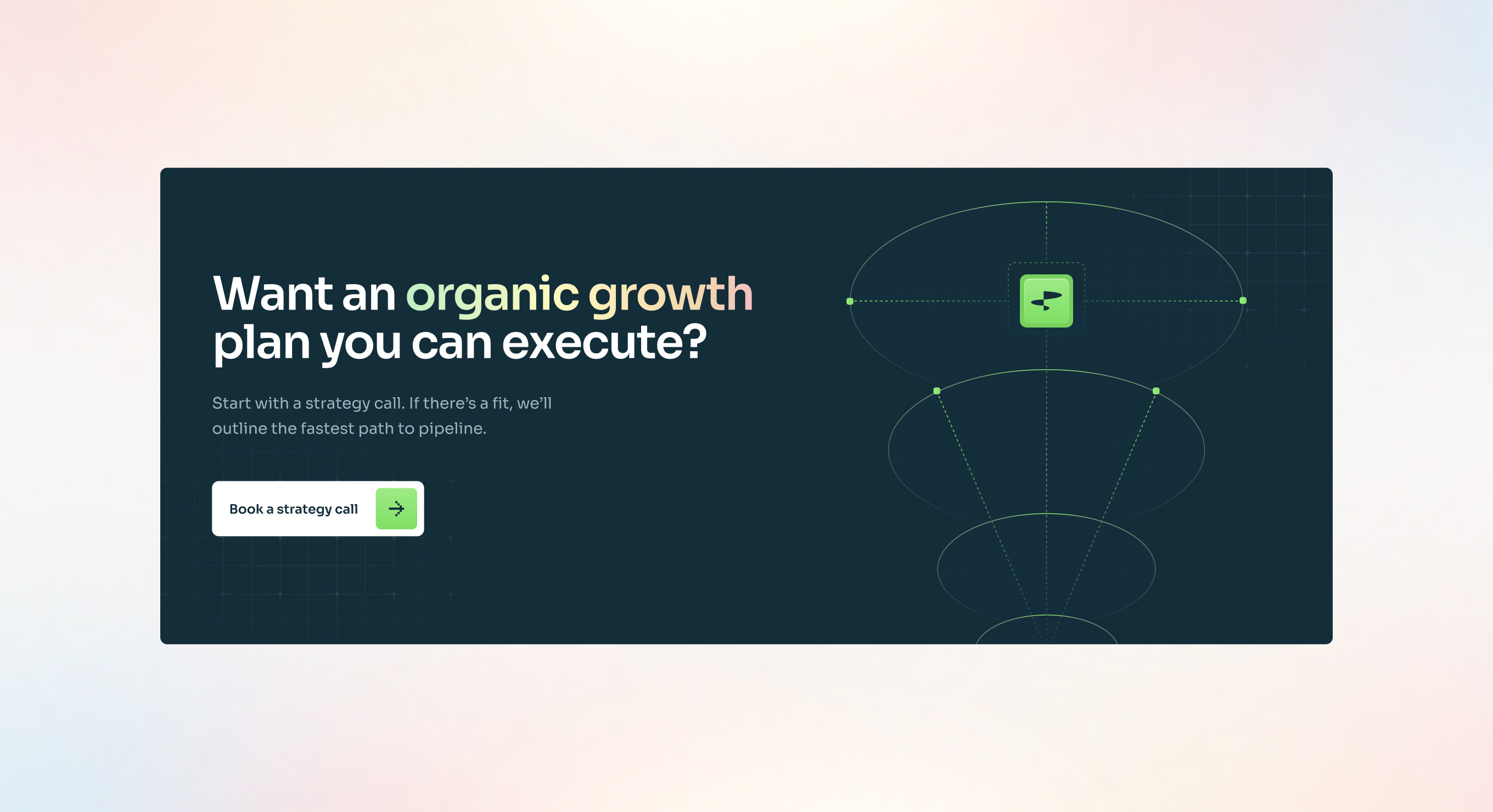
The biggest challenge was finding the right visual direction without a brand identity to start from. I went through several concept rounds to establish a style the client felt confident in — balancing a dark, authoritative aesthetic with enough warmth to feel approachable to their audience.
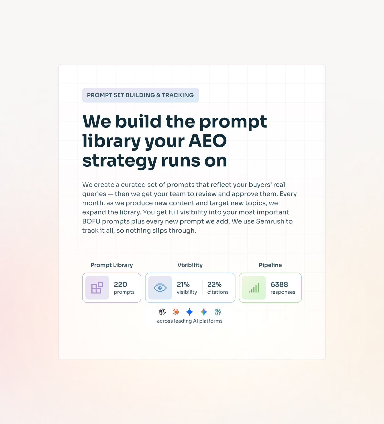
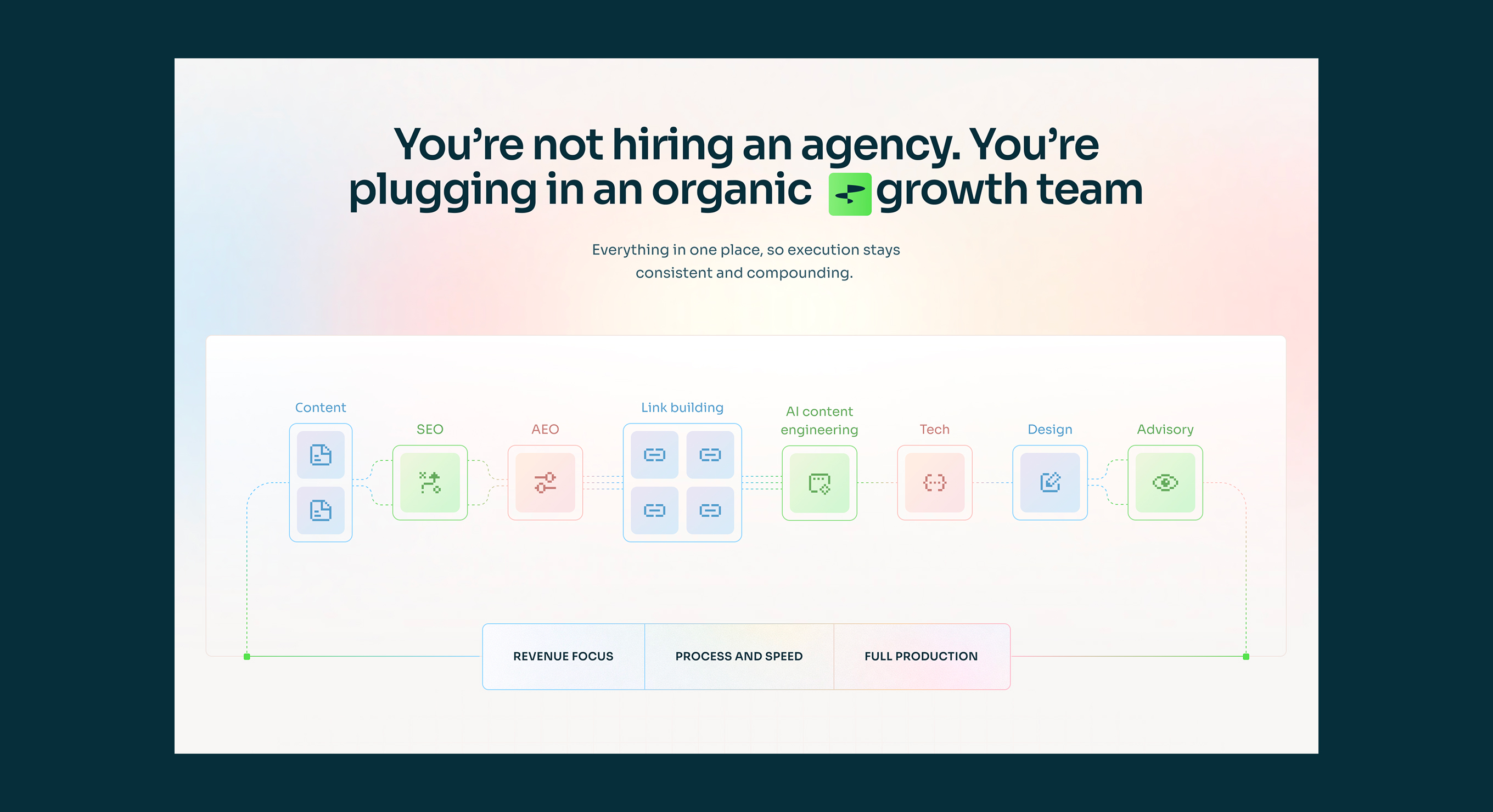
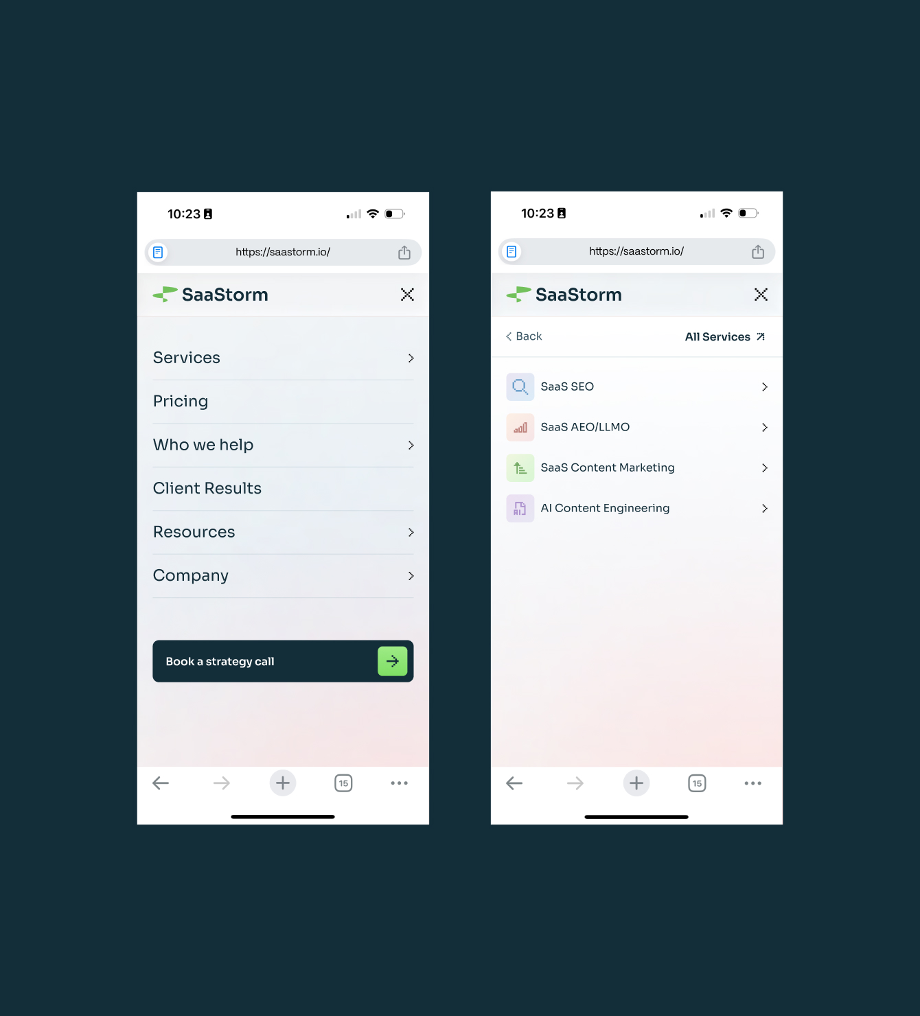
The volume of content across 9 pages also required a structured approach. I used AI tools to generate low-fidelity prototypes from the client's content, which gave both the team and the client a fast, shared understanding of page structure before visual design began.
Design system
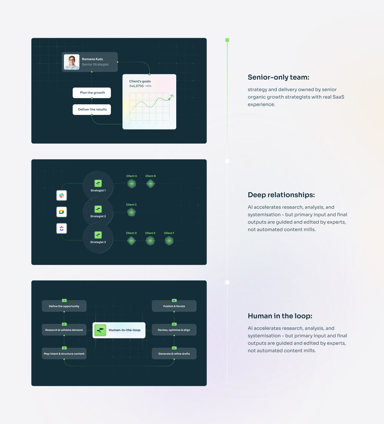
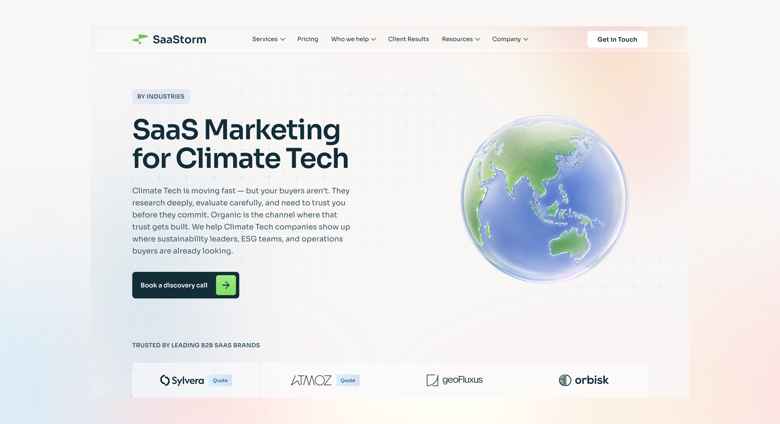
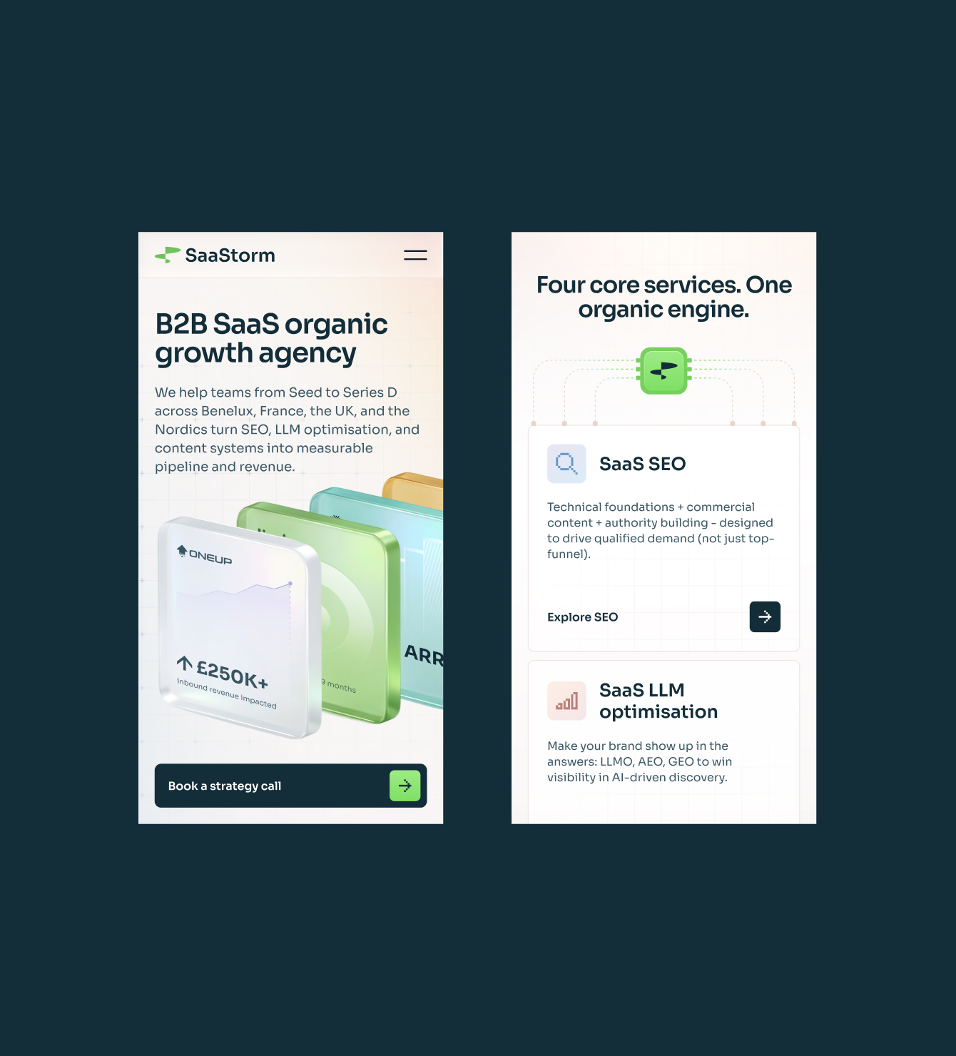
I built the Figma file as a proper system from the start — color styles organized by function (Text, Action, Surface, Border, Icon), a full component library, and reusable section patterns across all pages.
This made it possible to design 9 pages consistently and give the developer a clean, navigable handoff file.
Key Takeaway
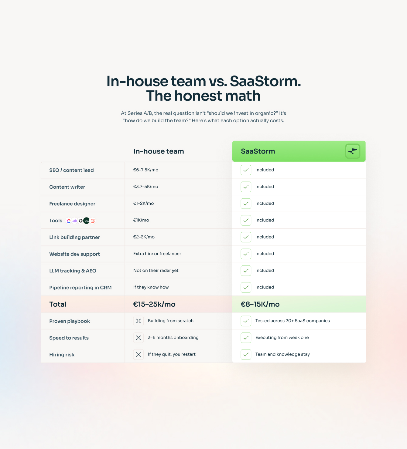
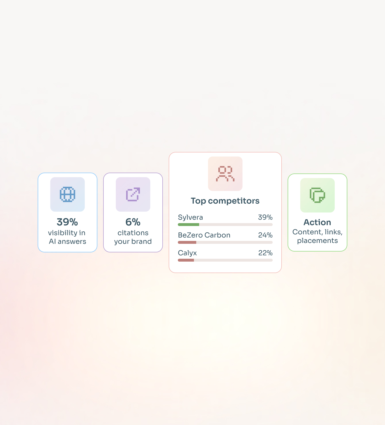
This project showed me how much the craft of design has compounded for me. The site is visually complex — detailed infographics, layered layouts, a dark system with precise color logic — and it came together cohesively because the system was built right from the start.
Using AI tools to prototype content structure before designing also saved significant time and reduced back-and-forth with the client on scope.