iLNP — enhancing an e-commerce design system for a boutique nail polish brand
Visit website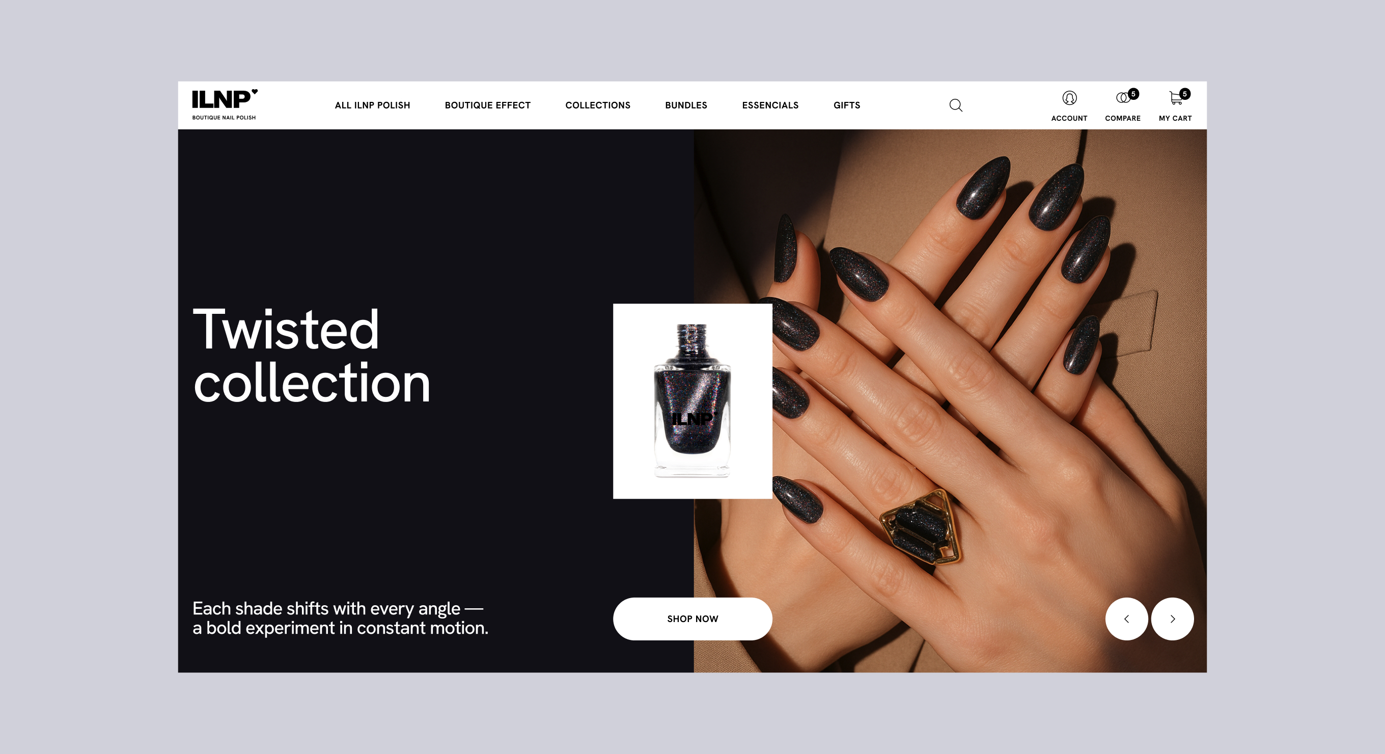
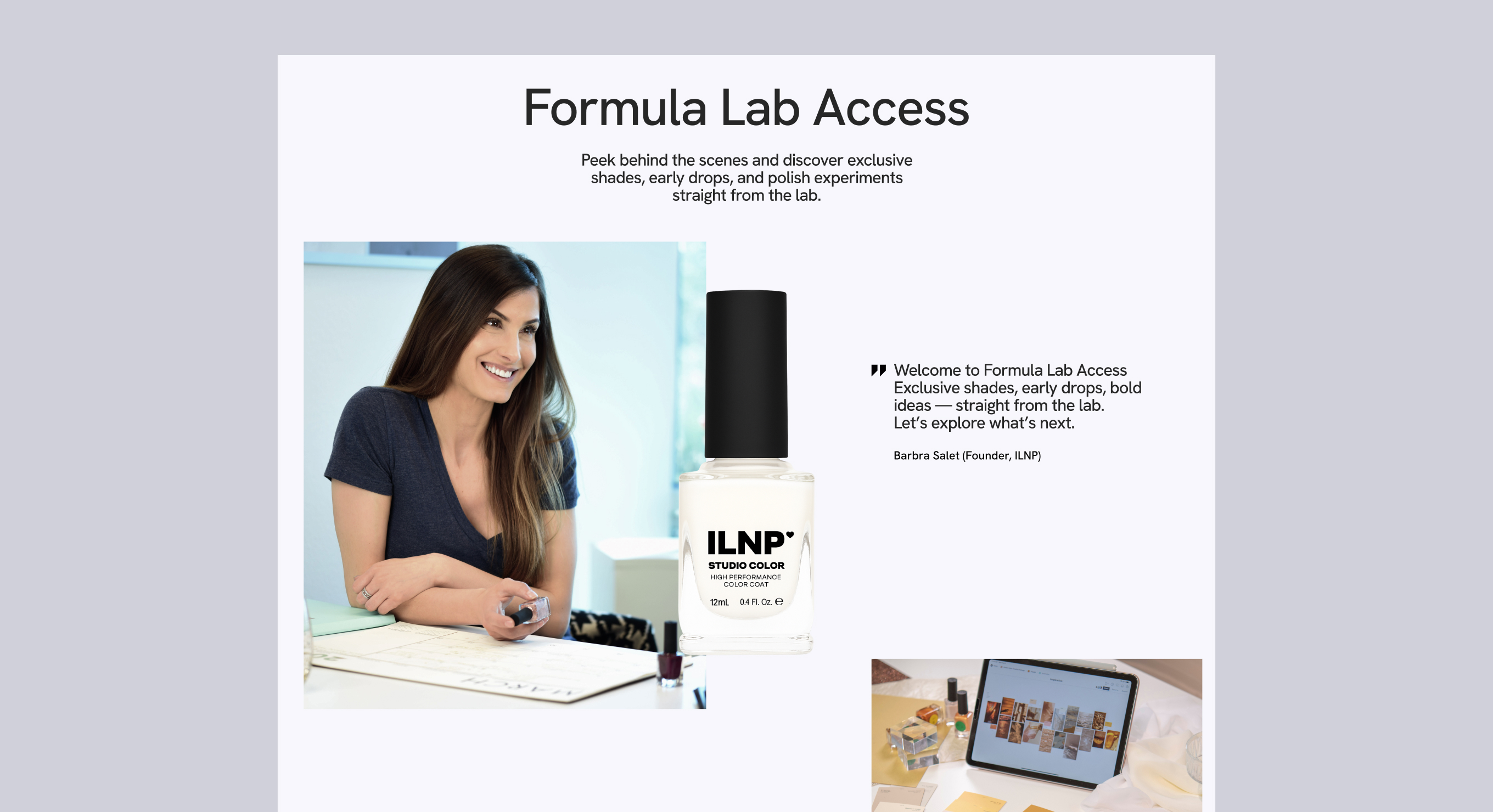
Overview
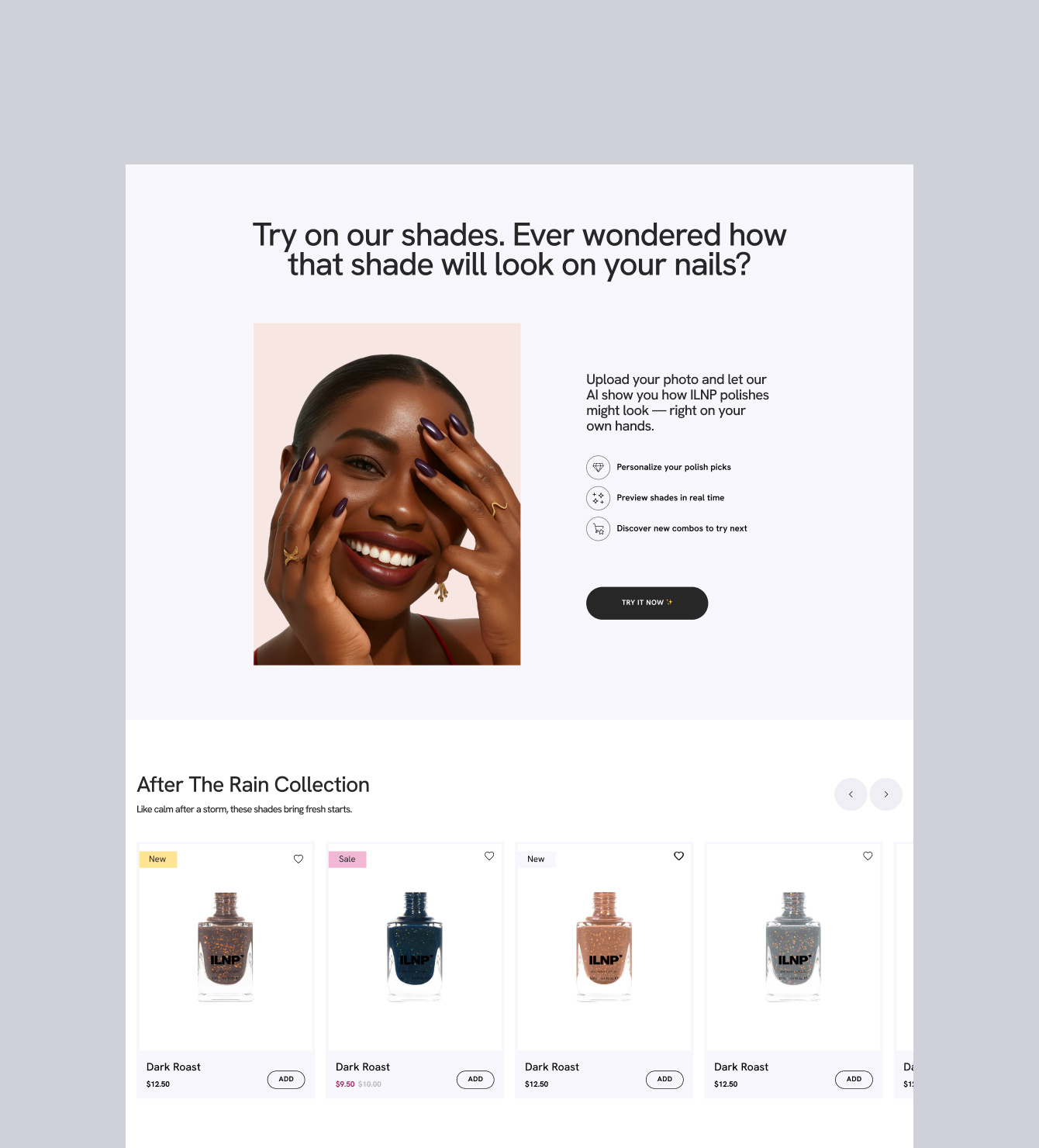
iLNP is a boutique nail polish brand known for its holographic and metallic shades, with an established e-commerce store and a mature design system developed by the team. My involvement focused on refining specific parts of the shopping experience — improving usability, adapting components to new requirements, and exploring a conceptual design refresh at the client's request.
This project was an exercise in working within constraints: understanding an existing system deeply enough to extend it thoughtfully, rather than reinventing it.
My Role
- Adapting and extending existing components within the established design system
- Improving product card layouts, particularly for mobile viewports
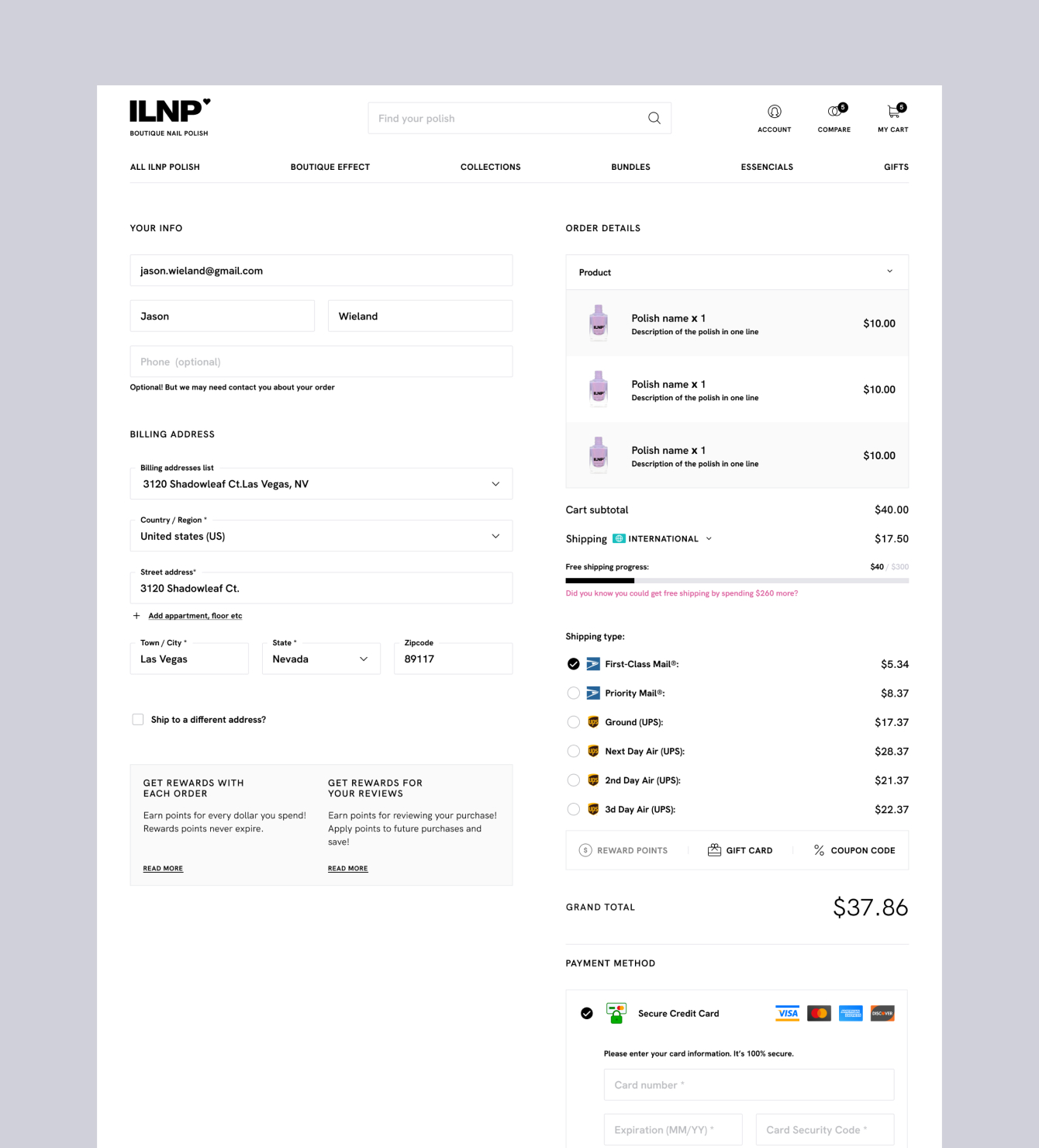
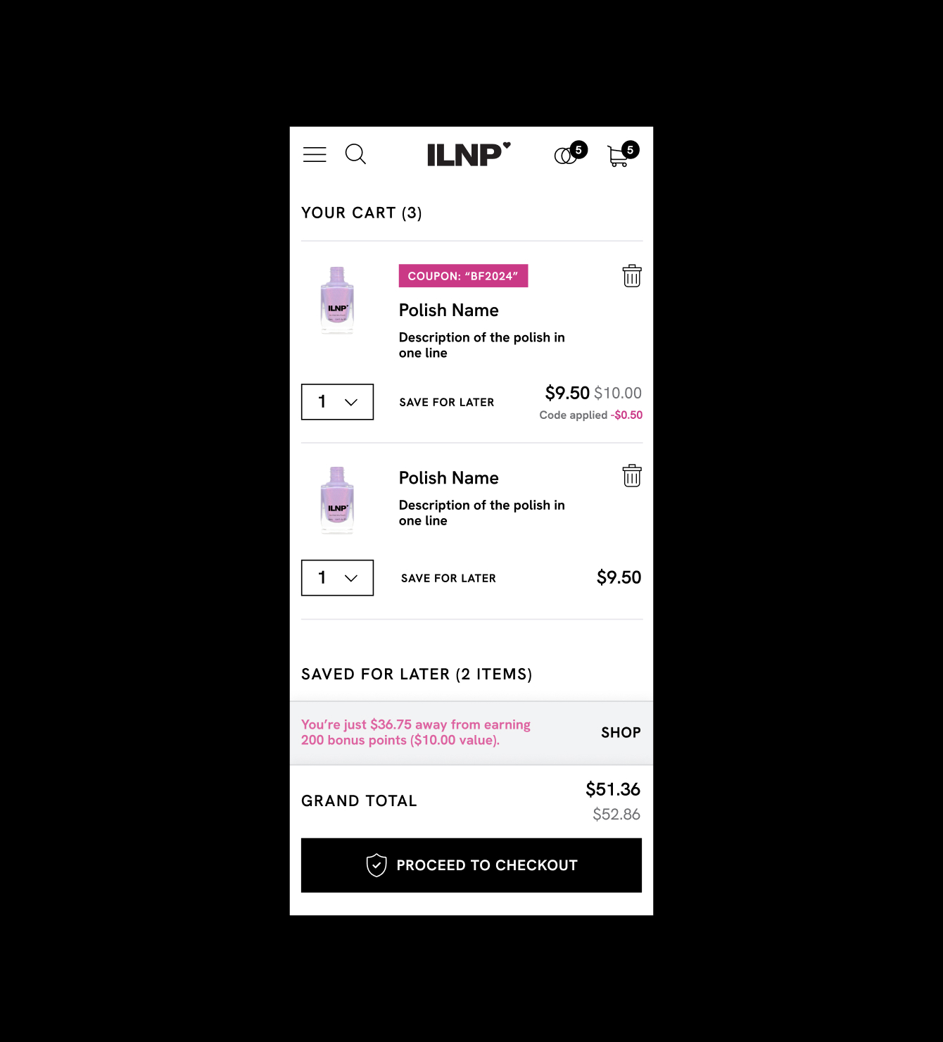
- Redesigning the cart (My Cart) screen — clarity of item states, coupon logic, out-of-stock handling
- Refining navigation patterns and menu structure
- Developing a conceptual visual direction as an exploratory redesign proposal

Project Goals
Challenges
Working inside someone else's design system means every decision has a ripple effect. The challenge wasn't designing from scratch — it was knowing where the existing system could stretch, and where it needed a new pattern entirely.
The cart screen in particular required thinking through multiple states at once: an empty cart, items on hold, applied coupons, unavailable products. Each state needed to feel consistent with the rest of the system while being immediately clear to the user.

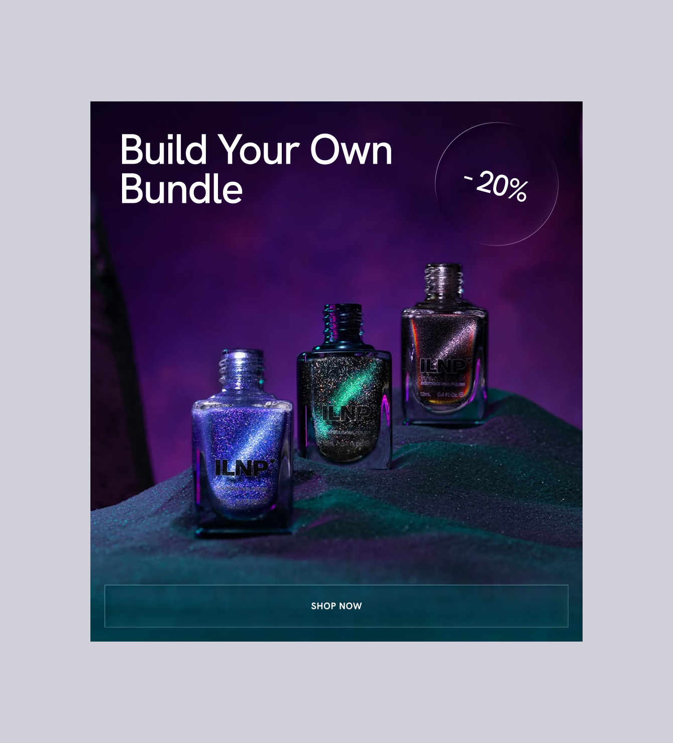
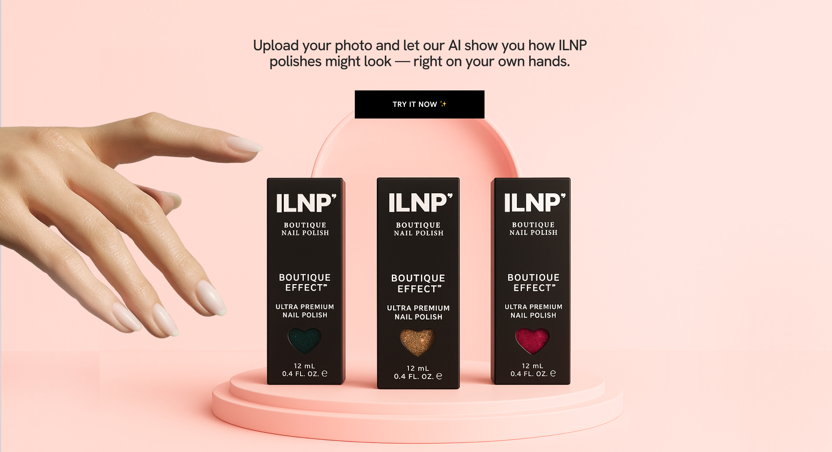
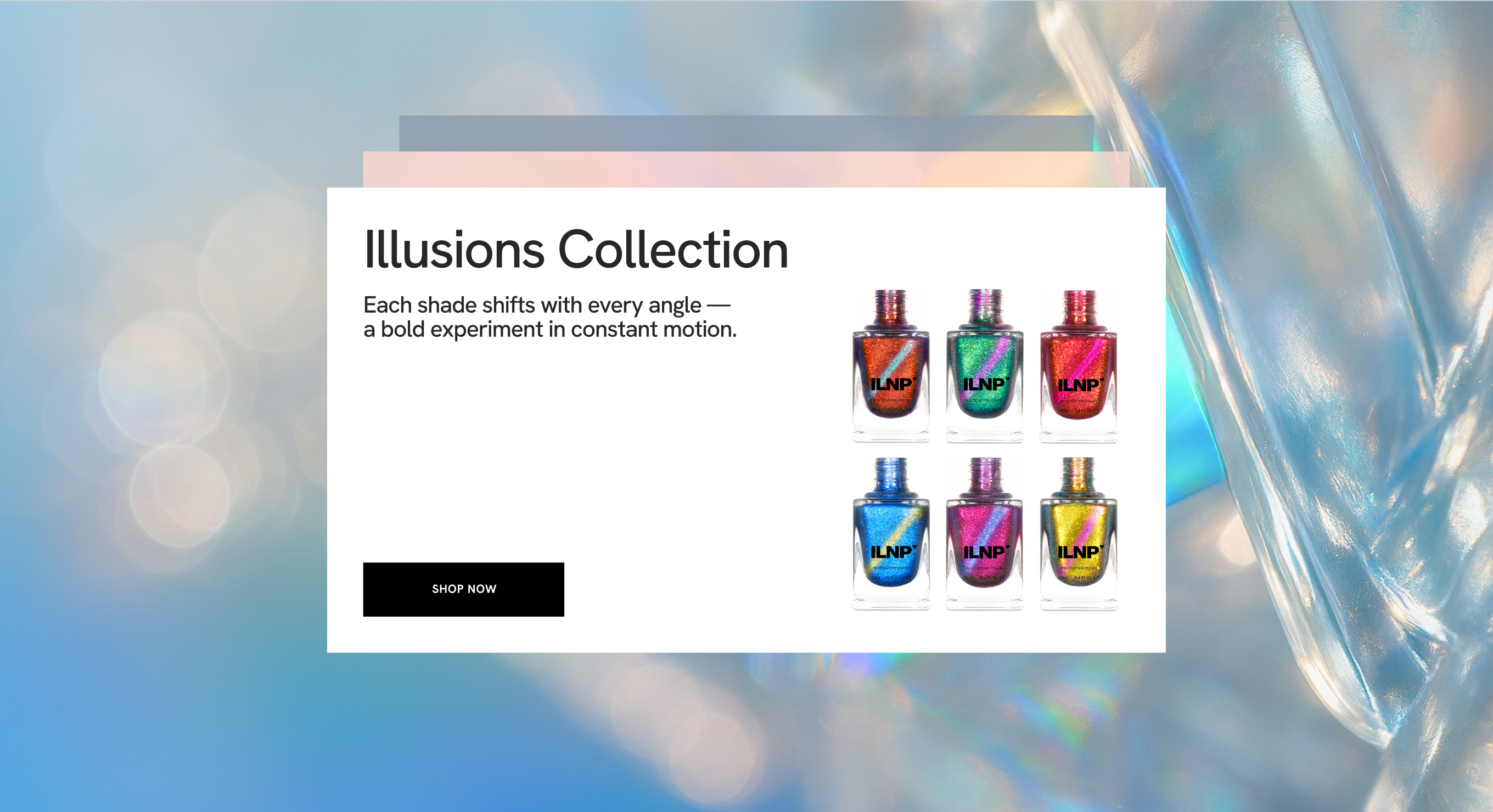
Conceptual Redesign
Alongside the refinement work, the client asked for a more open-ended exploration — a concept that could take the brand's visual identity in a new direction. This gave me space to work more freely with typography, layout density, and overall visual energy while still respecting the brand's premium positioning.
Key Takeaway
This project taught me that working within an existing design system is a skill in itself. You have to resist the urge to redesign everything, stay aligned with established patterns, and make targeted improvements that feel native — not patched.
It also reinforced how much clarity matters in transactional flows. Cart and checkout screens carry high user anxiety — every ambiguous state is a potential drop-off.