Global Standards — building a brand identity system for an international certification body
Overview
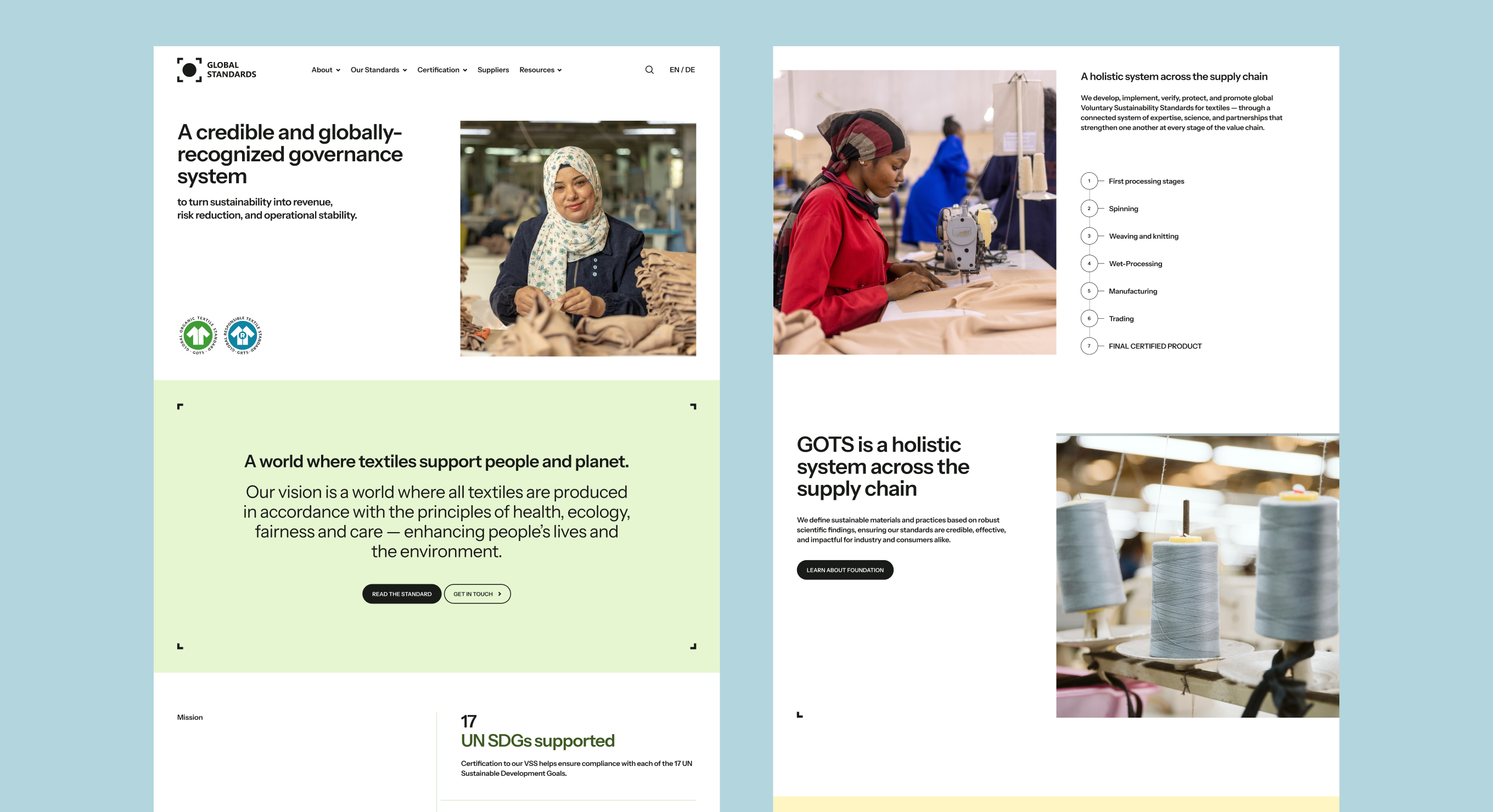
Global Standards gGmbH is an international certification body focused on responsible, structured decision-making across complex global supply chains. The project was to build their full brand identity system from the ground up — a comprehensive visual language that could scale consistently across digital, print, and social media.
My role was to translate the brand strategy (developed by the Art Director and management) into a complete, documented design system — something any team could pick up and apply correctly without needing a designer in the room. Delivered as a 56-page brand book.
My Role
- Developed the full brand book — logo system, color palette, typography rules, core graphic elements
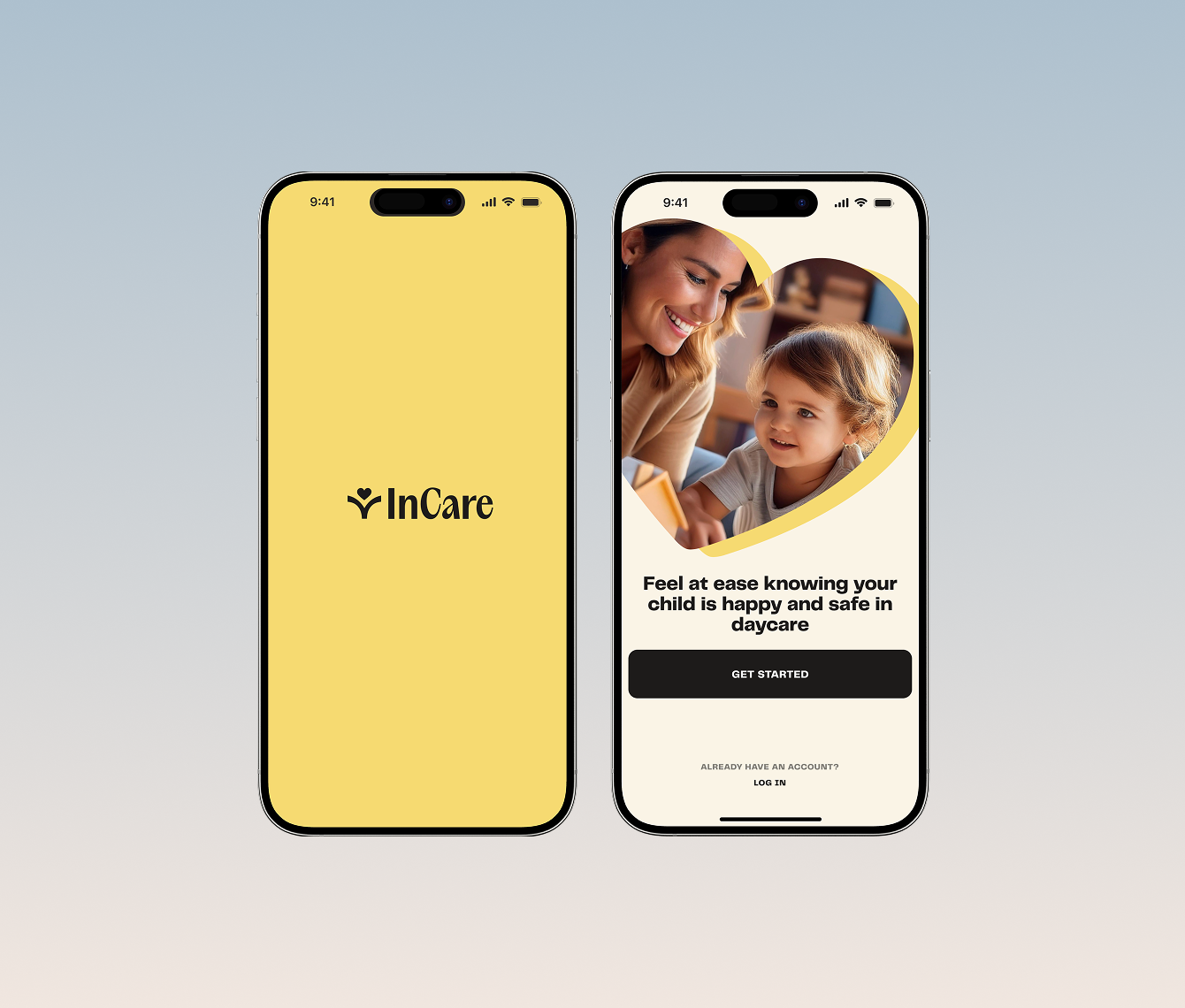
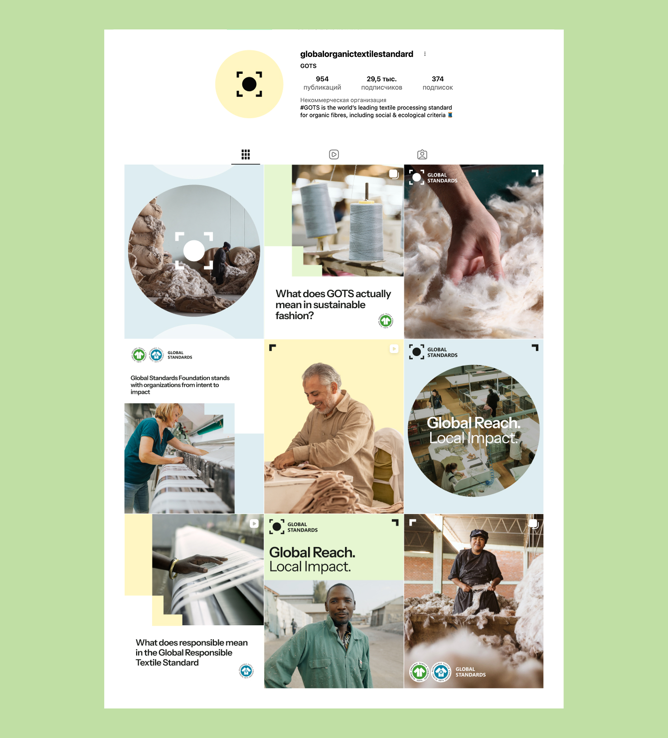
- Designed reusable social media templates for Instagram and LinkedIn, with Do's & Don'ts documentation
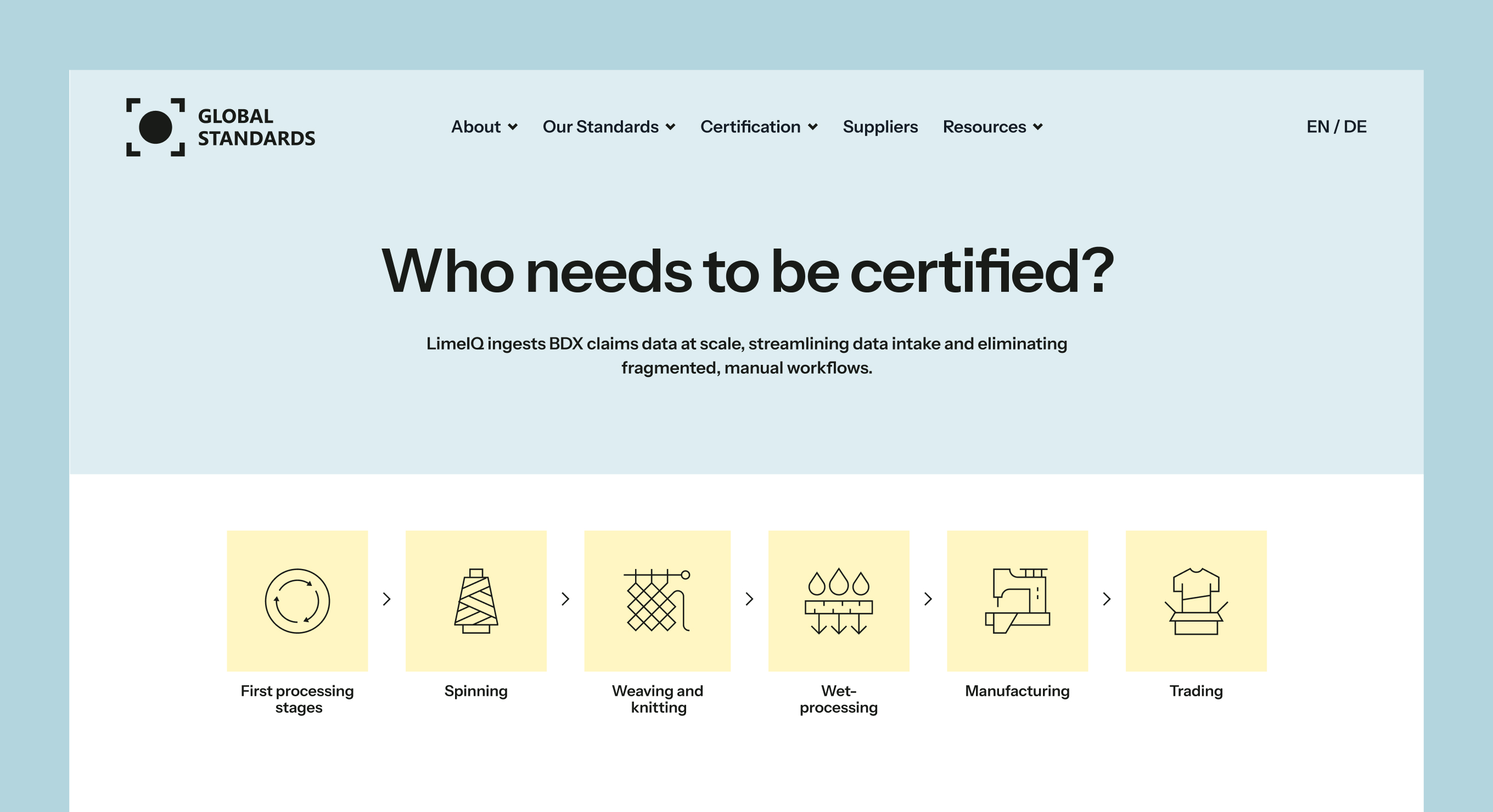
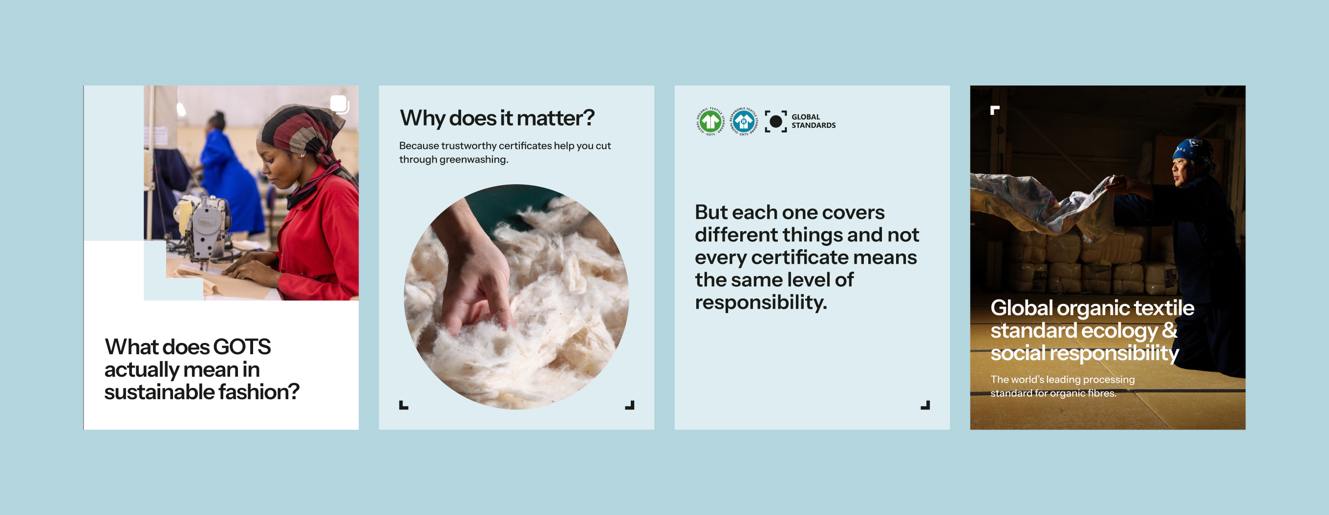
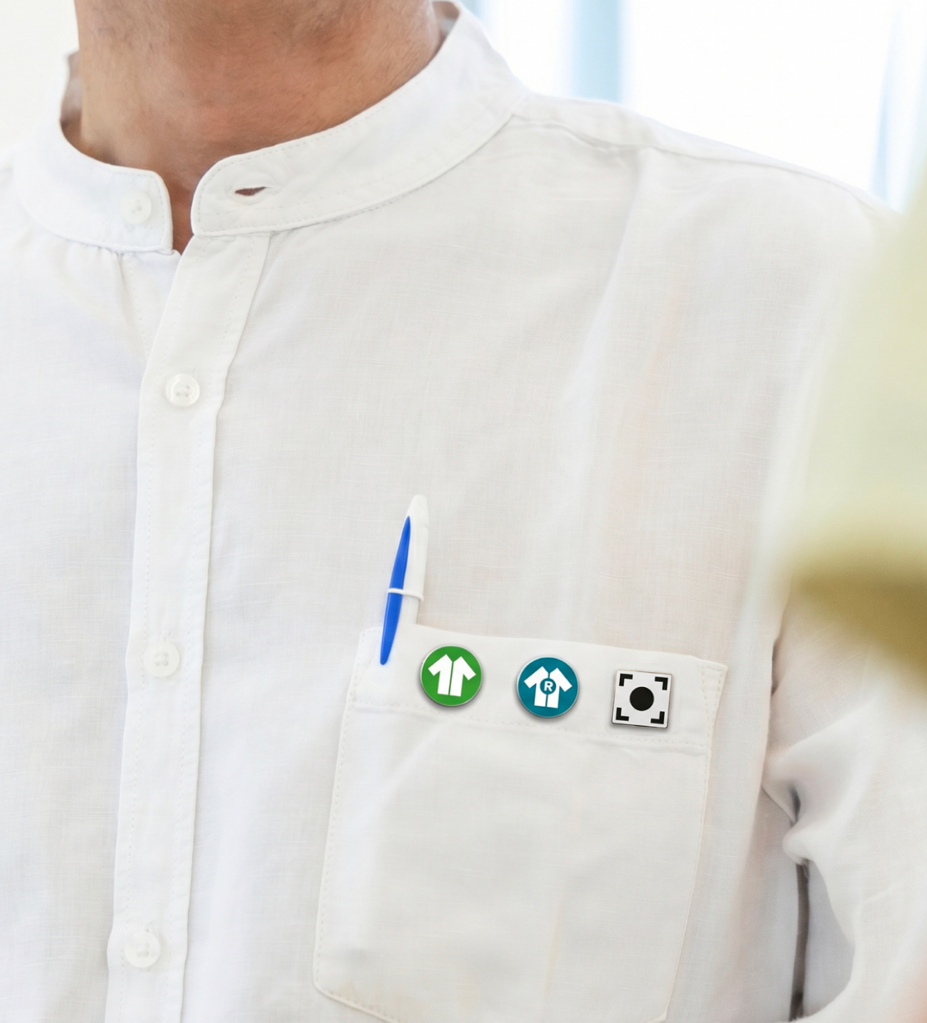
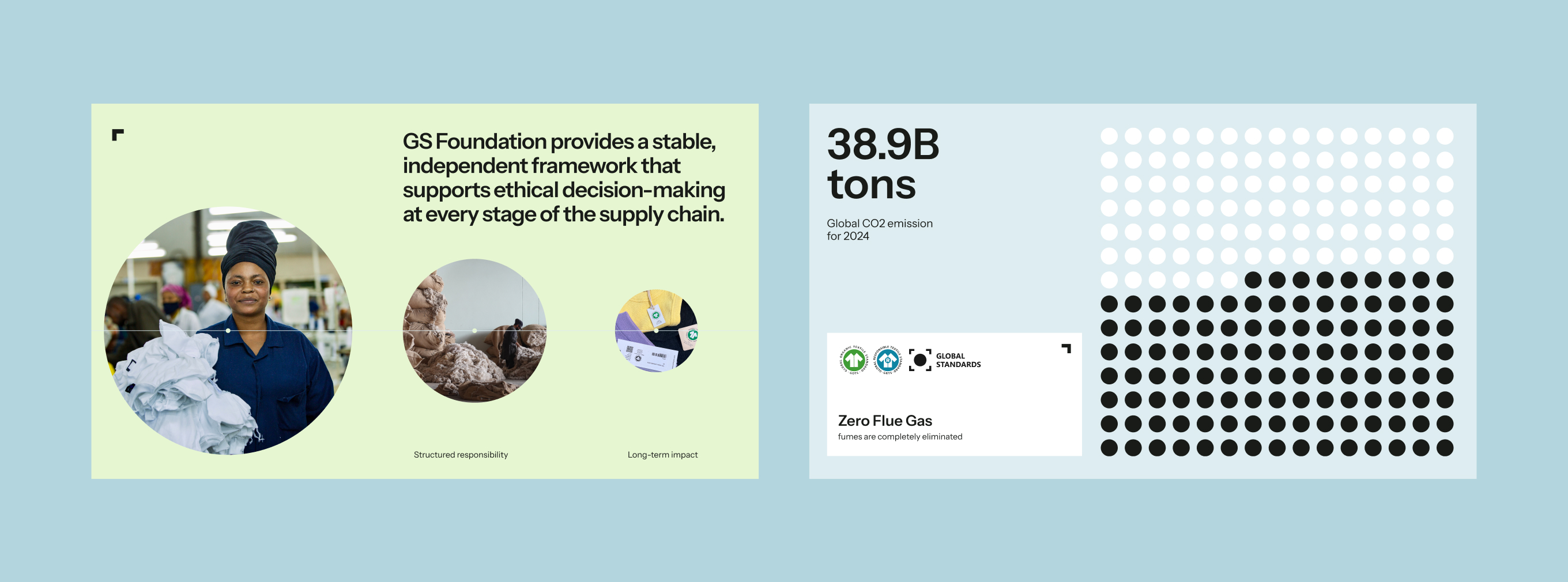
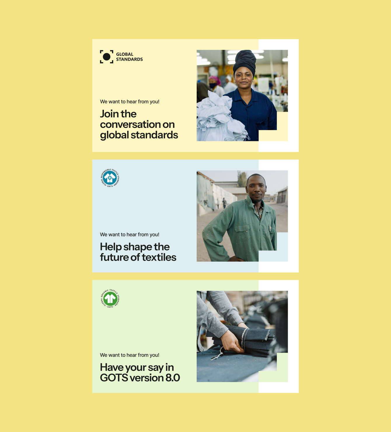
- Created digital and print application examples, infographics, and visual assets
Project Goals
Design system
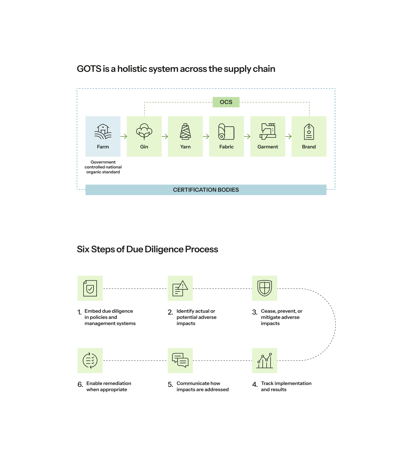
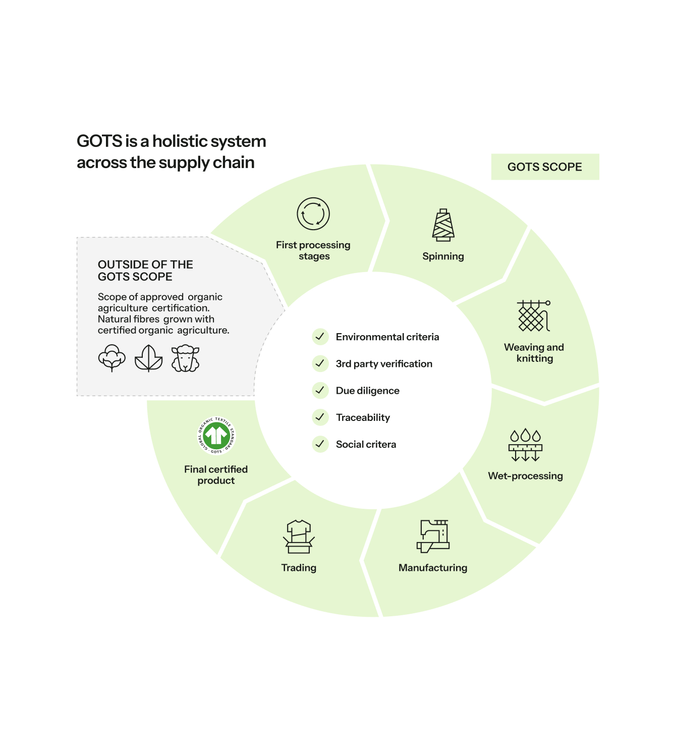
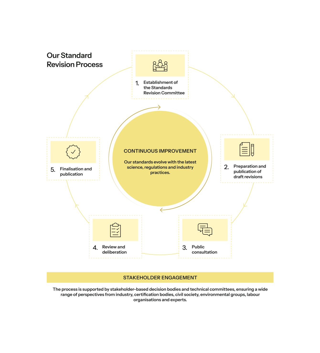
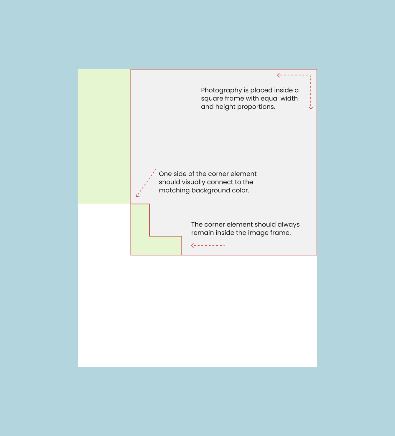
The visual language is built from three core elements derived directly from the logo — Square, Corner, and Circle. Each has specific rules for how it can be used: as a structural frame, image mask, infographic element, or background composition. Together they create a consistent visual signature without feeling rigid.
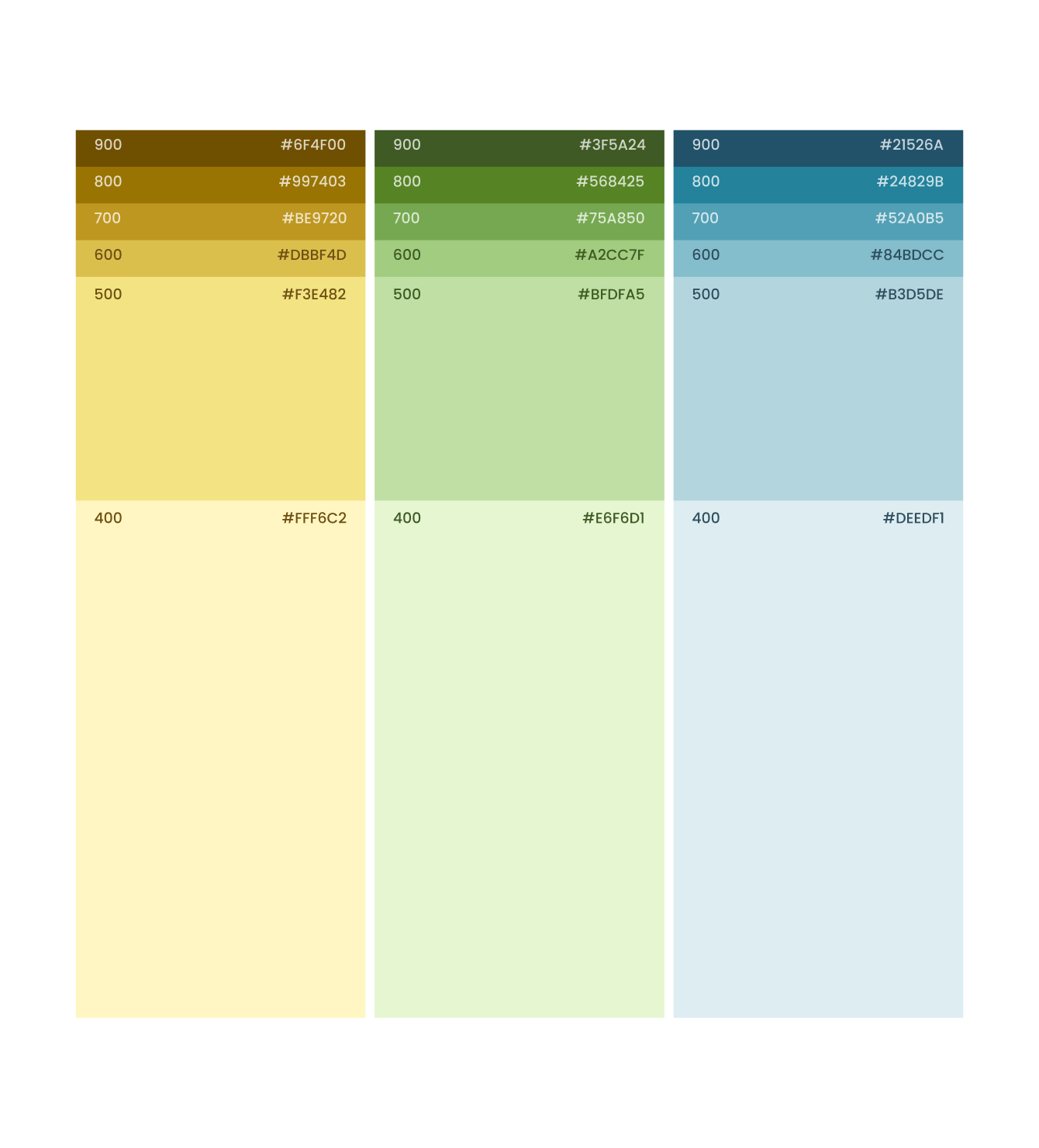
The color palette — Soft Sunlight, Fresh Sage, Mist Blue — uses warm natural tones as backgrounds paired with black or white text. I built a full shade scale (100–900) for each color, plus functional colors for error/warning states, all documented with accessibility contrast checks.

Key Takeaway
This project shifted my thinking about what design work actually means at scale. Creating guidelines is harder than creating designs — you have to anticipate every misuse, document every exception, and make the rules clear enough that someone who wasn't in the room can still get it right.
It also gave me deep experience with brand systems thinking: how a logo becomes a graphic language, how a color becomes a functional system, and how visual consistency builds institutional trust.